LO1: Conceptualize, design, and
develop interactive media products
Introduction
You create engaging concepts and translate them into professional validated media products by applying
user-centered design principles, visual design techniques and by exploring emerging trends and
developments
in media, design and technologies.
Self assessment: Advanced
Dating app assignment
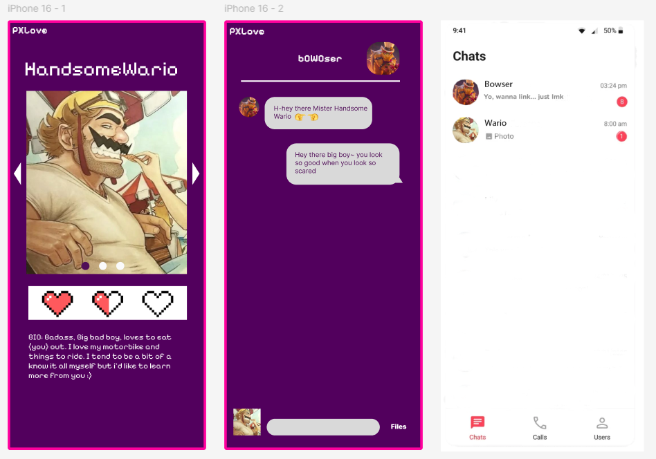
Our group made a quick concept and design of a Super Mario dating app. This was a 30 minutes pressure
cooker assignment and helped with thinking fast and team building.
Applied DOT-method: Brainstorm (Workshop)
This method was applied during a 30-minute pressure cooker assignment where we rapidly generated and
refined a concept as a group.
By brainstorming under time pressure, we explored multiple ideas quickly and made fast design
decisions, which supported the conceptualization phase of the product.
My contribution:
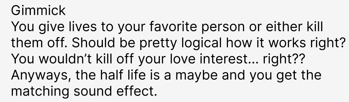
Came up with the gimmick, which is matching based on how many “lives” you would give or take.
Situation
We were given a 30-minute pressure cooker assignment to quickly create a concept and design for a
dating
app.
Task
The task was to collaboratively generate a creative concept under time pressure while maintaining
team
alignment.
Action
I actively participated in a brainstorm session (DOT: Workshop – Brainstorm) where I came up with
the
main gimmick of the app, focusing on a playful mechanic based on “lives.” I also contributed to the
visual concept by creating supporting imagery.
Result
The team successfully delivered a complete concept within the time limit. This assignment
strengthened
my ability to conceptualize quickly and collaborate effectively, supporting LO1 by translating ideas
into a tangible media concept.
Reflection
Looking back, I noticed that my creativity stays strong under time pressure, especially when I focus
on one clear mechanic.
Next time, I want to communicate my idea even earlier in the brainstorm so the team can build on it
faster, and I would also like to document our quick decisions more clearly so we can explain the
concept more professionally afterward.
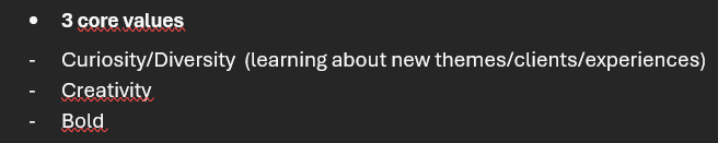
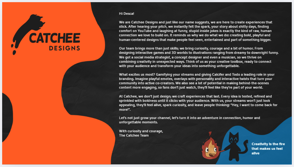
Agency branding
The assignment was to create our own agency and we came up with Catchee. The identity lies around
creativity, boldness and curiosity.
My contribution:
Mission (first version of it) & Vision
Conceptualizing cat attributes reflecting our core values & leading brainstorm
Moodboard (this one got chosen by the group)
Conceptualizing cat attributes reflecting our core values & leading brainstorm
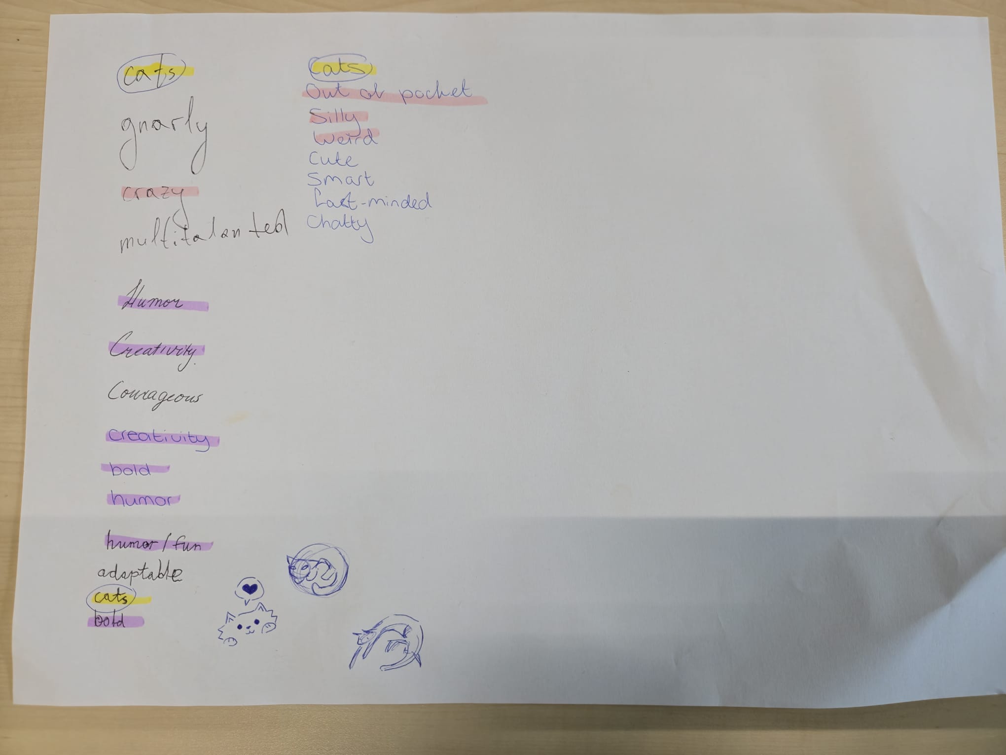
So first we took a big piece of paper and we wrote down everything that we as a group had in common.
Things that are important to us, what we've seen and heard from each other. Because we really wanted
the brand to reflect who we are at our core.
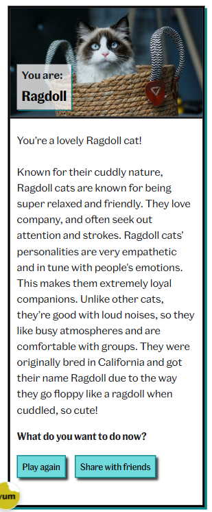
From this we found out that we all like cats and act a bit like cats too. So we all took a
personality test to see which cat fits us best.
This is my result:
I do resonate a lot with this result, however I can get stressed very easily when things are not
clear in my mind.
We based our core values on ourselves and on outdoor cats. Because outdoor cats explore the
neighborhood. They are very curious and have a desire to explore anything new. They come and go
where they want. They are creative problem solvers, as they come to clever solutions when they want
to do something forbidden. It shows strategic thinking and adaptability. They can also be very bold
once they want something.
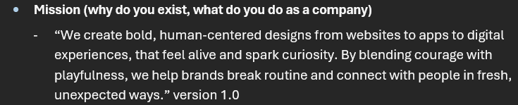
Mission
For our mission, what was truly important to us as a group was communicating what we're doing right
now in alignement with our core values. It was to create products that make people
feel more alive and awake.
This is because we experience the weight of the same routine everyday and want to put in some fun. So
that's when I came up with this:
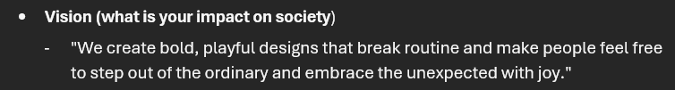
Vision
Our vision is an expansion of this mindset that came from our mission. We'd like to see people
embracing more joy, fun and step out of the ordinary:
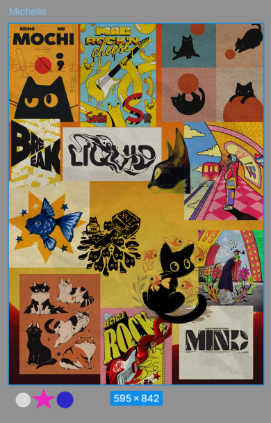
Moodboard (this one got chosen by the group)
So for our branding, I made a moodboard to show what kind of idea and visualization I had in mind for
our brand. This was based on our core values, mission and vision:
What I wanted to focus on with this concept, was to work with of course the cats, but show
versatility through different art mediums like paint, paper, ink etc. This is also how I wanted to
showcase the brightness of our brand and the playfullness in the cats.
Situation
Our group was tasked with creating a fictional agency, including its identity, mission, vision, and
visual direction.
Task
My task was to help define the core values and translate them into a coherent brand identity.
Action
I facilitated a group brainstorm (DOT: Workshop – Brainstorm) to map shared values and
characteristics. I also researched existing agency branding styles to understand best practices
(DOT: Library research – Best, good and bad practices). Based on this, I developed the first version
of the mission and vision and created a moodboard.
Result
The chosen moodboard and brand direction aligned strongly with our values and were adopted by the
group. This process demonstrates my ability to conceptualize and design a validated media identity,
directly supporting LO1.
Reflection
This assignment showed me that I work best when I can translate abstract values into concrete
visuals and language.
I also learned that “inspiration” becomes stronger when it is supported by explicit references or
best practices, not only by intuition.
Next time, I want to include a short comparison of similar agencies or visual identities and write
down why we chose certain directions, so the branding decisions are more easily validated.
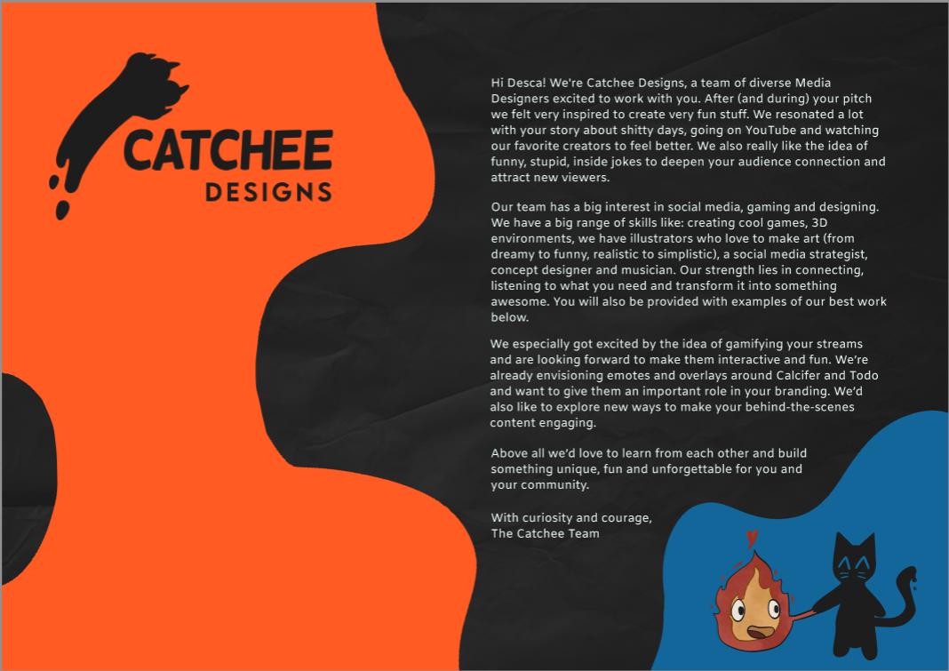
Motivation Letter
So at this stage of the semester, we had to choose our project and after seeing all the possible
clients' presentations, the one that really stood out to me was Desca. I really like that kind of
project and would maybe like to dabble in streaming too in a later time.
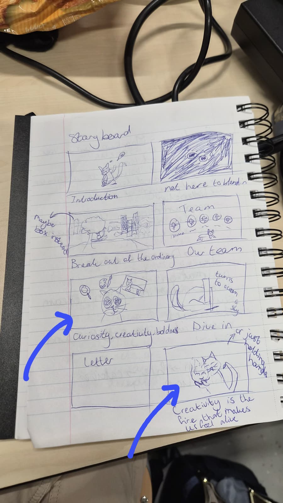
I wanted to be more creative with the motivation letter and wanted to make a small video based on our
agency. They would be a few frames per drawing in my storyboard:
I had in mind to say hi first, then say a few words based on our slogan, missions and vision, then
introduce the team, then our core values, have a fun frame with more wordplay, insert our letter and
end with a cute frame with calcifer and blobby cat.
In the end some of the groupmembers said that it would be too much and discarded the idea. They only
wanted to do a letter so I started out with the first version of the letter to set the tone:
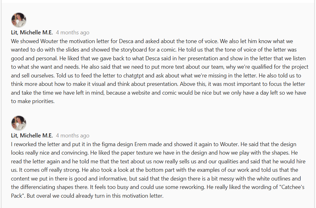
Here you can also see the feedback I got from Wouter:
This is how I rewrote the letter after the feedback:
After writing the letter and seeing what some of the other groups did, I didn't want to just stop at
the letter and came up with the concept of making the motivation letter to Desca Streamer themed. In
the meantime another groupmate rewrote the motivation letter again.
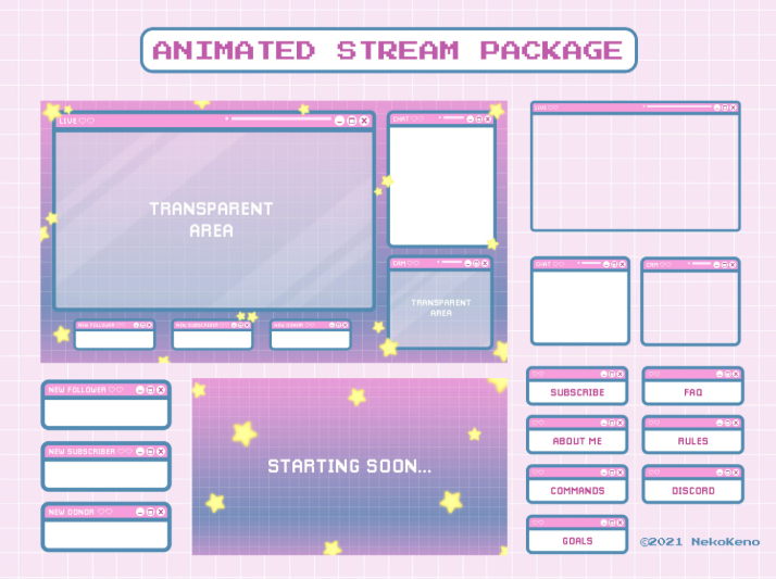
These are the inspo pics I gathered for the streamer themed letter:
What I wanted most was the structure of a starter screen, the screen for the letter, skill screens
for the team introductions and an ending stream screen. The rest of the team helped with putting
some of the screens together too.
So you our skills are to be seen under the stream screen, our best work is "being streamed" and shown
with a description in the chat, lastly our pictures are shown where normally the webcam footage is.
And here you can see how I implemented the inspiration into the letters:
Situation
We had to write a motivation letter for a client project selection, representing our agency
professionally.
Task
My task was to create a motivation letter that stood out creatively while remaining clear and
professional.
Action
I first explored a visual storytelling concept and then wrote an initial version of the letter.
After receiving feedback from a lecturer (DOT: Field – Expert interview), I iterated on the content
and tone (DOT: Lab – Iteration), refining clarity and alignment with the agency identity.
Result
The rewritten letter was clearer and more professional. This process shows how feedback and
iteration improved the quality of the media product, supporting LO1.
Reflection
This process taught me that creative ideas only work when the message remains clear and aligned with
the goal.
The expert feedback helped me step out of my own perspective and improve the professionalism of the
letter.
Next time, I want to prototype the structure earlier (for example with a quick layout draft) and ask
for feedback sooner, so I can iterate more efficiently without losing time.
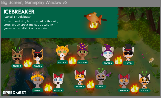
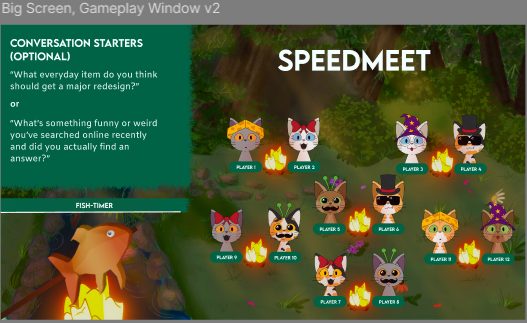
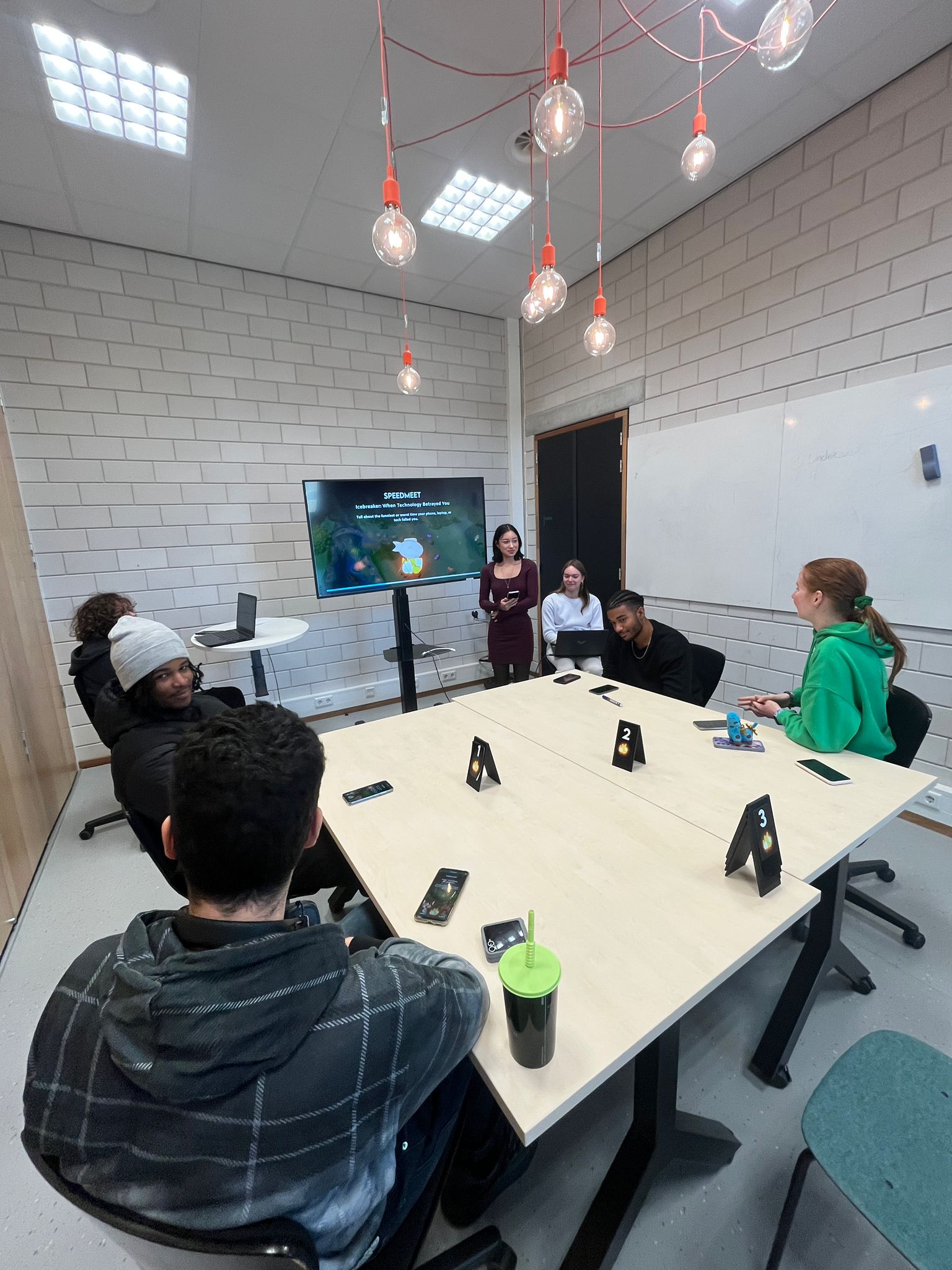
Speedmeet Concept
So after we sent our letters in for the assignment, we were chosen for our second option, which was
Futurebites. For them we have to make a game called Speedmeet and for now it's a game written on
paper.
It is our task to make a new concept/version of Speedmeet that is digital and engaging. The concept
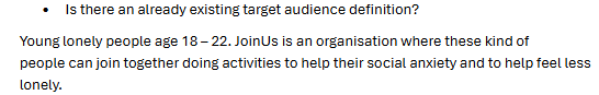
of our Speedmeet version was something that I had a lot of idea’s for.
The target audience is young adults around 18 and 22 years old who
struggle with social contact. This was
established after the first client meeting. It was one of the one of the questions we asked our
client Jacqueline from JoinUs:
Also we all did some research about social anxiety and games to start. You can find my research in
LO2
I’ve looked at a
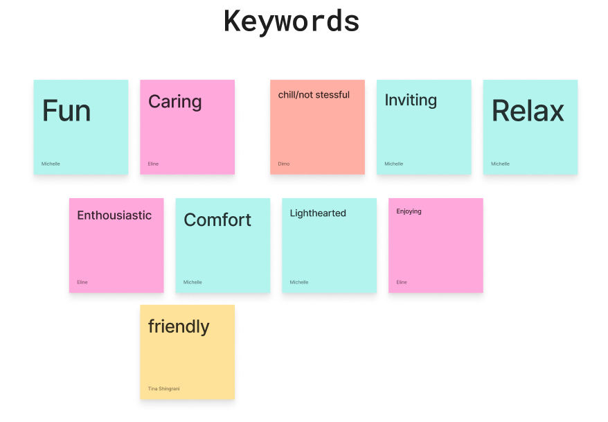
lot of reference materials like anime and games. Things that work mostly as ‘escapes’ or something
better than reality. At first me and the group brainstormed and put down keywords that we want to
convey:
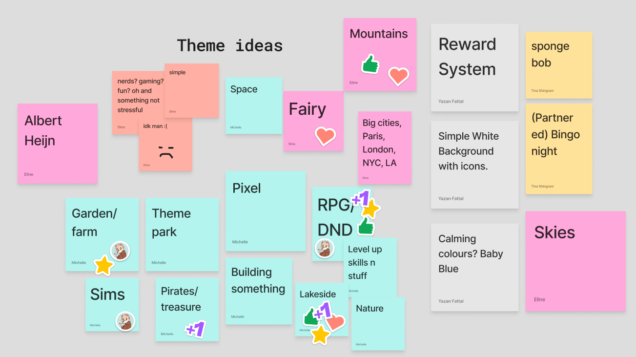
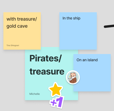
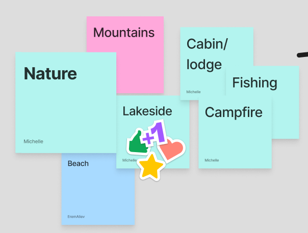
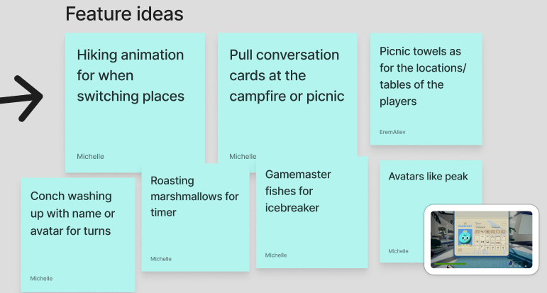
Then we quickly put down any themes that came in mind and we voted on which was best:
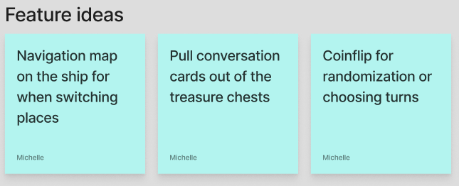
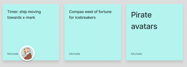
From this, the themes that were voted on most, were mine and I worked them out in how I would
envision them as functions within our game:
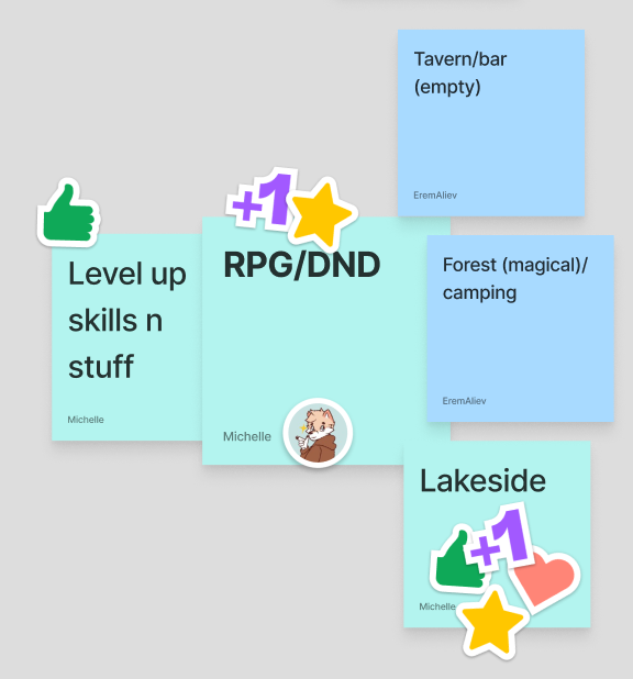
The pirates concept:
For this concept I took a lot of inspiration from One Piece. That's one of the most popular animes
that exist. It's an anime about pirates, friendship, humor, etc.
The Lakeside concept:
For this concept I mainly took inspiration from Peak, which was a pretty new game at the time. It’s a
game where you and your friends are scouts that have been stranded on an island after a plane crash.
You have to climb your way up through different biomes. From this I was mostly inspired by the way
the game looks.
RPG/DND concept:
For this one I took inspiration from Baldurs gate 3, Warhammer and Monster hunter wilds. They are
roleplay games and also have co-op functions, so a lot of the time you have to work together and
that stimulates trust.
STARR Reflection
Situation
Our group was selected to work for JoinUs on a digital version of Speedmeet, aimed at young adults
struggling with social contact.
Task
The task was to develop a new engaging concept that fit the target audience and client goals.
Action
I participated in a client meeting where we asked questions to define the target audience and
requirements (DOT: Field – Interview). I then analyzed existing games and media experiences that
reduce social anxiety (DOT: Library research – Available Product Analysis). Together with the team,
we brainstormed themes and voted on concepts (DOT: Workshop – Brainstorm).
Result
My concepts were selected as a foundation for further development. This ensured the concept was
user-centered and grounded in research, directly contributing to LO1.
Reflection
This proof made me realize how important it is to balance creativity with user needs and practical
constraints from the client.
Using a combination of Field, Library, and Workshop methods helped me make the concept more grounded
instead of purely aesthetic.
Next time, I want to translate the outcomes from the client interview into clear design requirements
more explicitly, so the link between research insights and concept choices becomes even stronger.
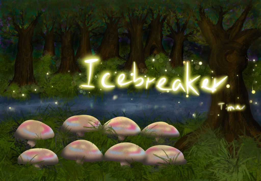
Sketching DND magical forest
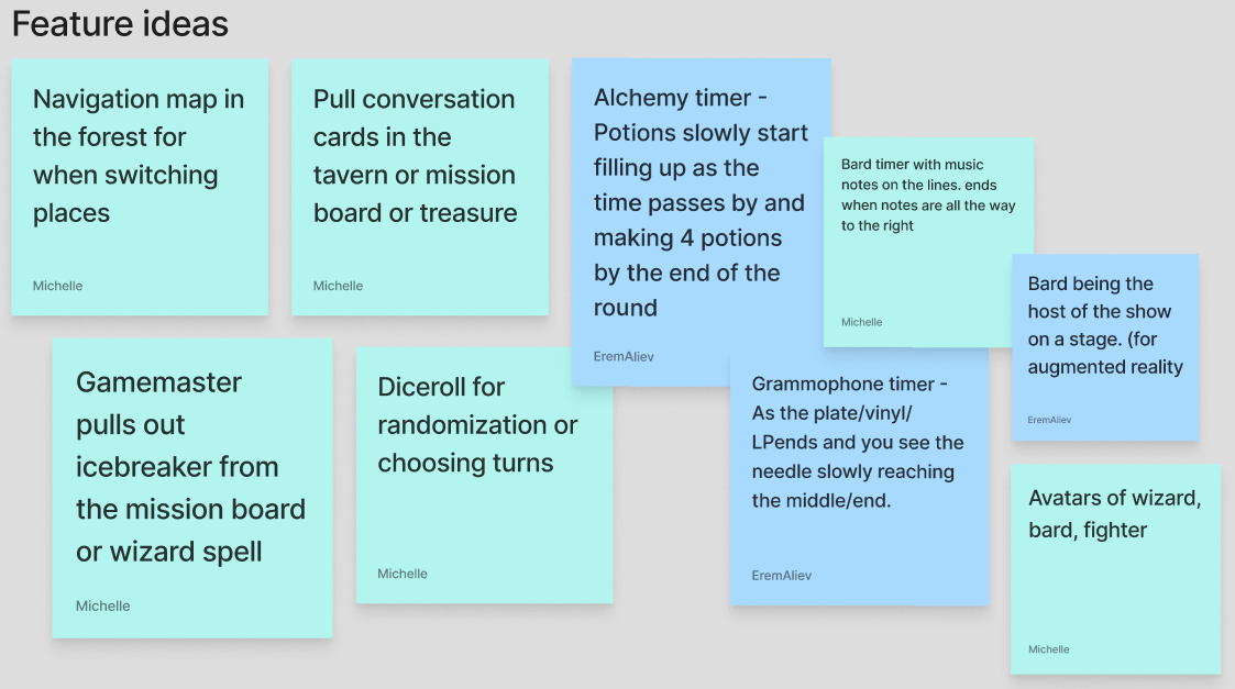
The group divided tasks around further concepting for the three themes and idea’s I came up with and
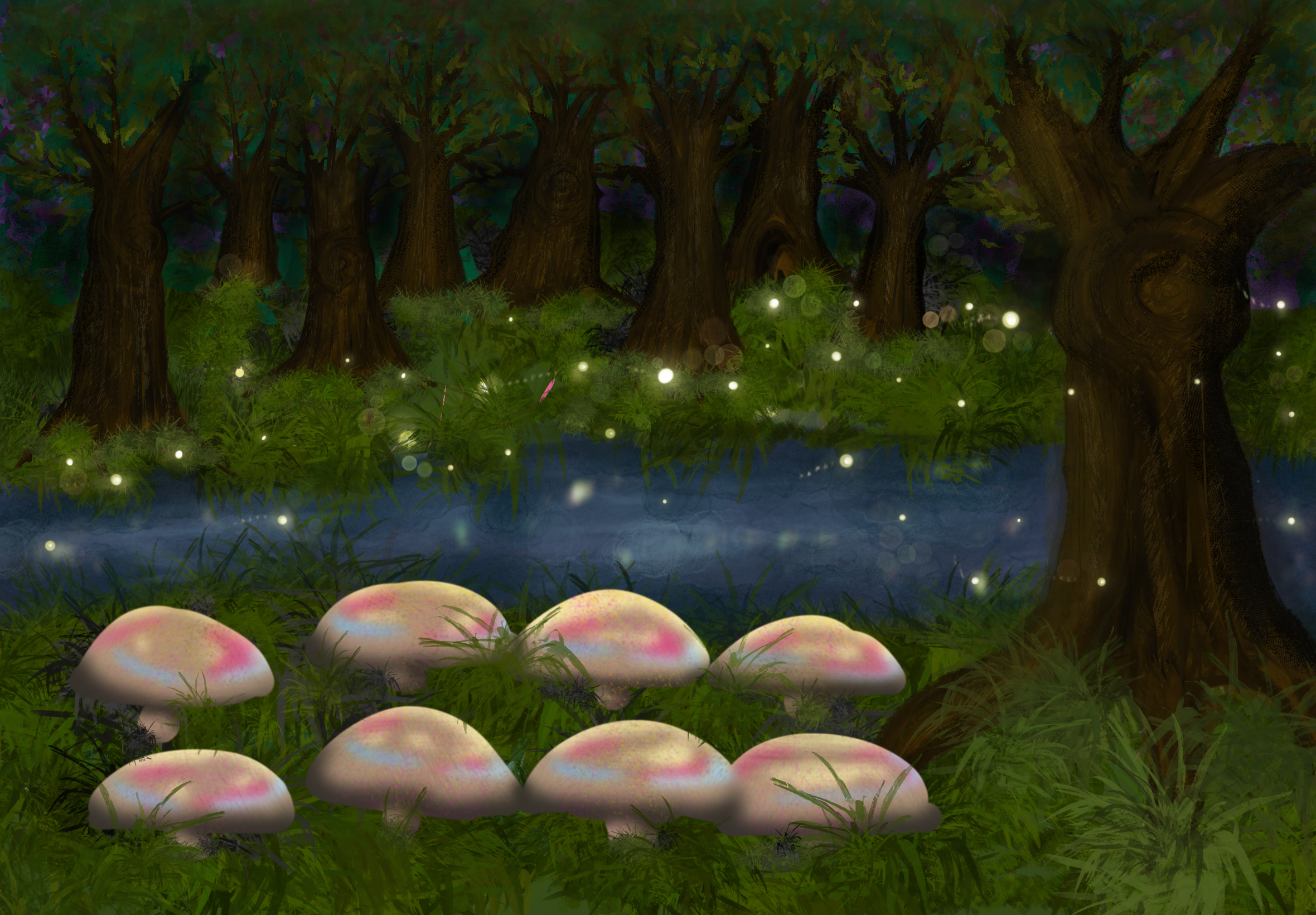
I was going to sketch the magical forest for DND. I made this in Procreate.
I wanted to have the avatars sit on the mushrooms and have the fireflies work as a timer and/or spell
out the icebreakers. But as I was working on this, there was apparently a decision to do the
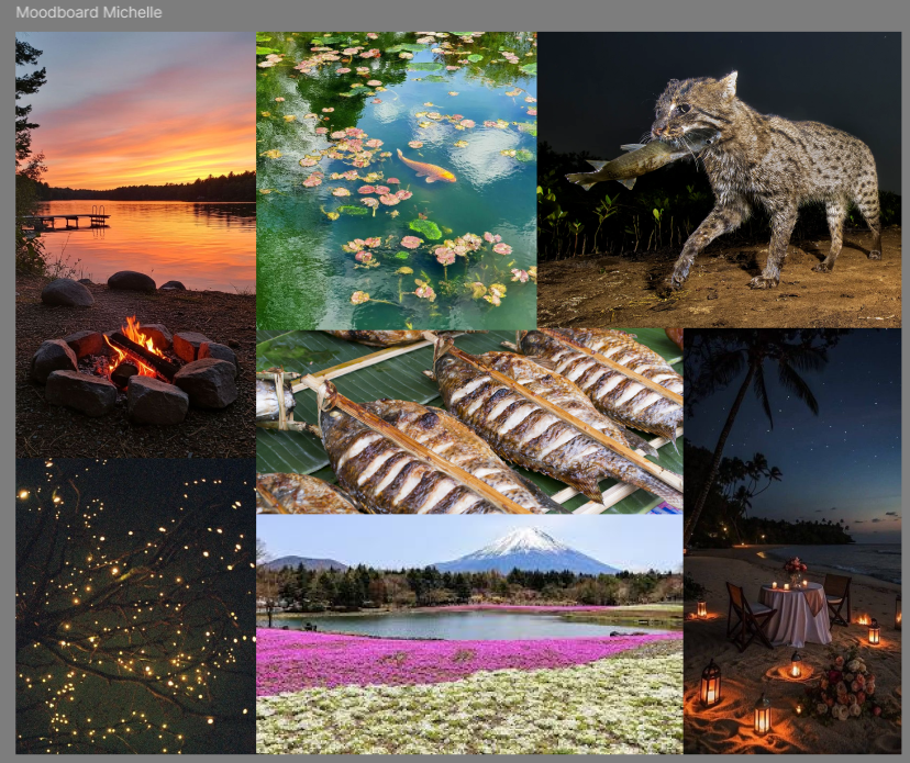
lakeside concept I came up with, but a variation to focus more on the campfire part of it.
For this I made a little moodboard to see how I could envision it:
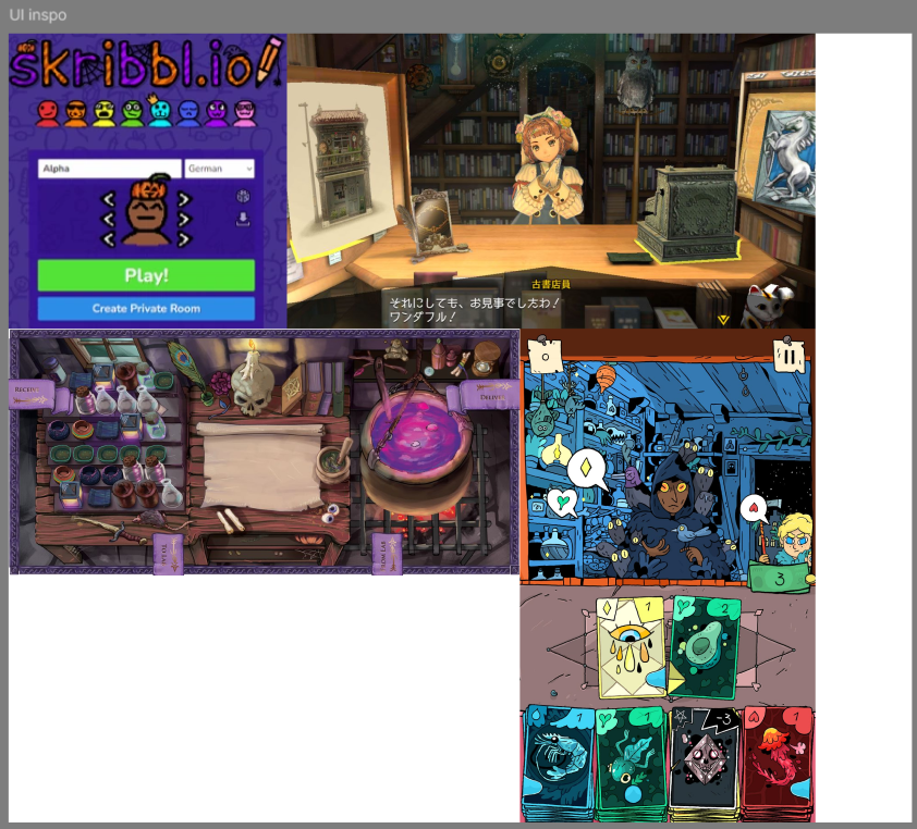
Also some inspiration I found:
I thought it would be really cool to have conversation cards as actual cards on your phone and see
the character of the person you’re talking to irl on your phone. The character customization made me
think a lot about skribbl.io and how peak does it. I also thought it was a fun idea to have a
virtual host on the big screen to guide our players. The layout of the potion game was also
something I thought looked cool and was something I’d like to try with Speedmeet.
STARR Reflection
Situation
During the concept phase, multiple visual themes were explored for the Speedmeet game.
Task
My task was to visually explore and translate abstract concepts into concrete environments.
Action
I created sketches and moodboards in Procreate to experiment with atmosphere, layout, and
interaction ideas (DOT: Lab – Visual exploration). I also used visual references from games and
animation to inform stylistic choices (DOT: Library research – Inspiration research).
Result
The visual explorations helped clarify which direction best supported calm and safe social
interaction. This supported LO1 by strengthening the visual design foundation of the product.
Reflection
This work confirmed that visual exploration helps me think through interaction ideas faster than
writing only.
However, I also learned that a strong concept direction needs alignment within the team, because
decisions can shift while I am working.
Next time, I want to create quick variation sketches earlier and share them sooner, so the team can
decide faster and my visual work stays connected to the final chosen direction.
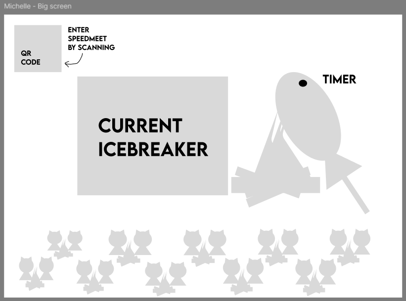
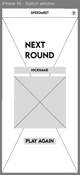
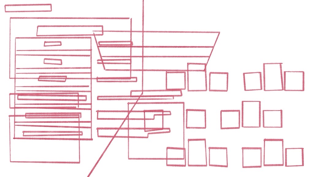
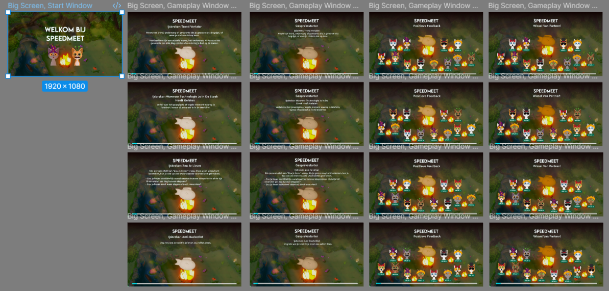
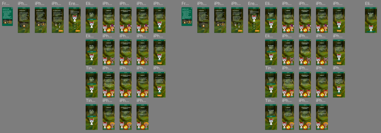
Wireframes Speedmeet
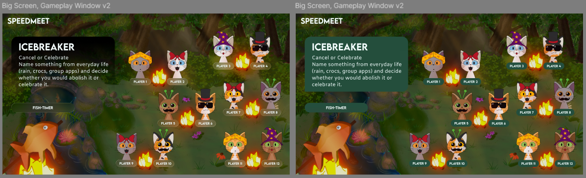
I made some wireframes for the big screen and the phone screen, but heard from Chris that they we
more prototypes than wireframes. Below you can see them:
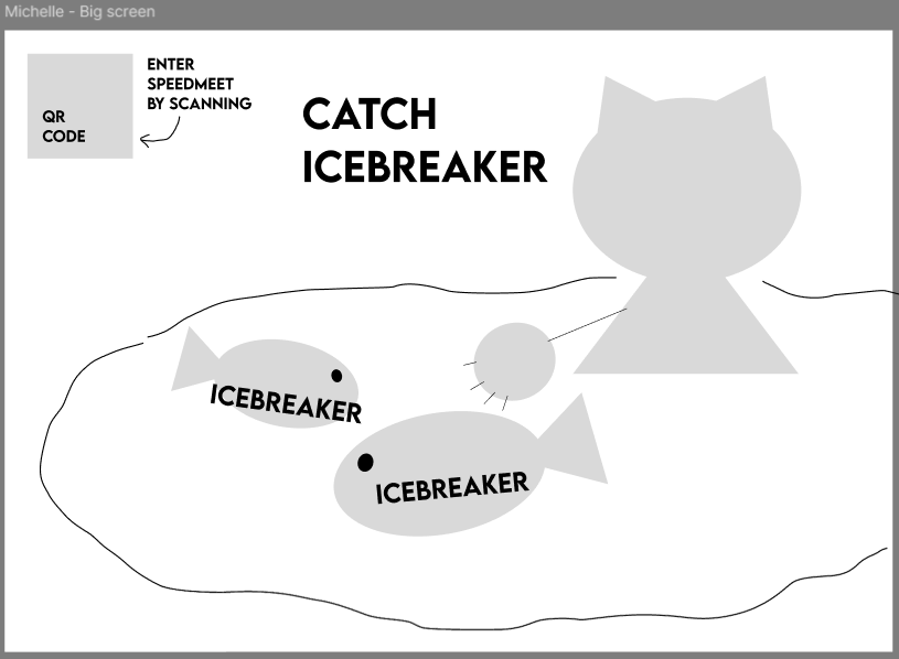
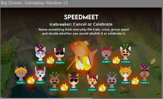
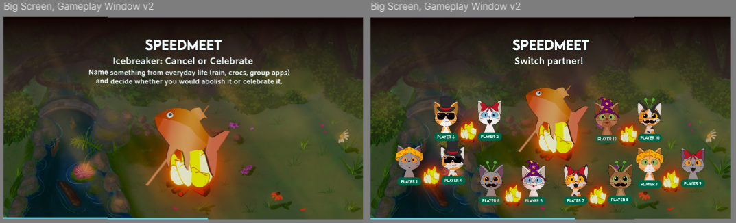
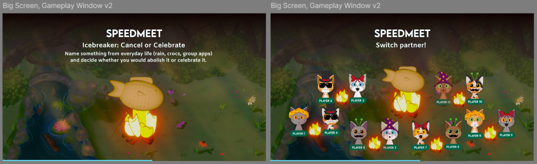
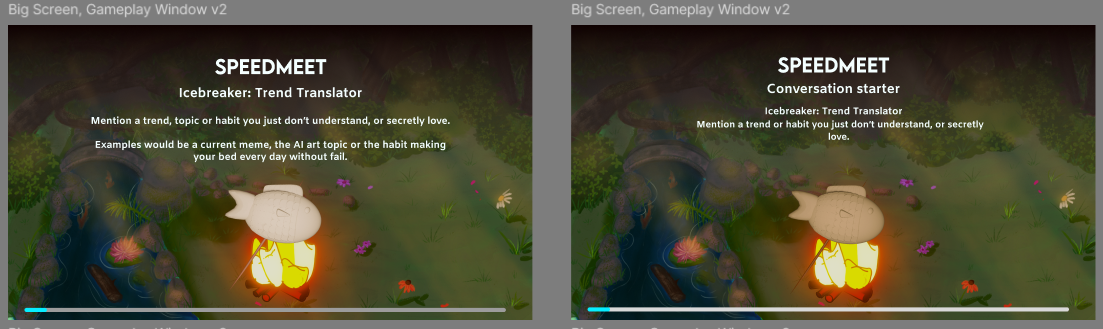
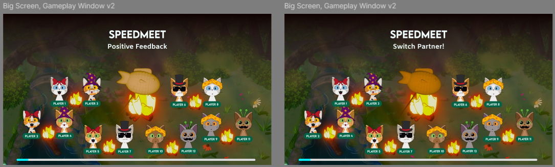
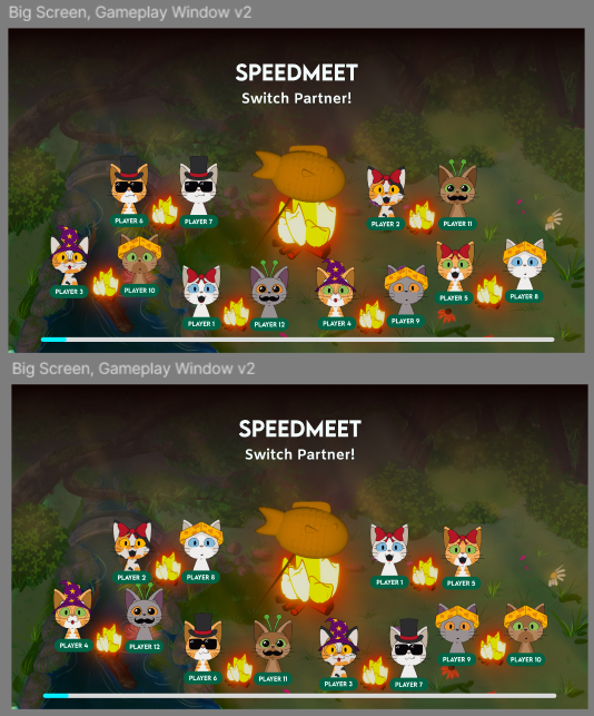
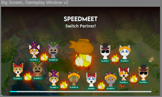
It would be nice to have the big screen display the icebreaker and have the cat catch the
icebreakers. Also a QR code for if people wanted to join during the game. I also thought it would be
cosy to have all the duos on the big screen so you can see where everyone is seated.
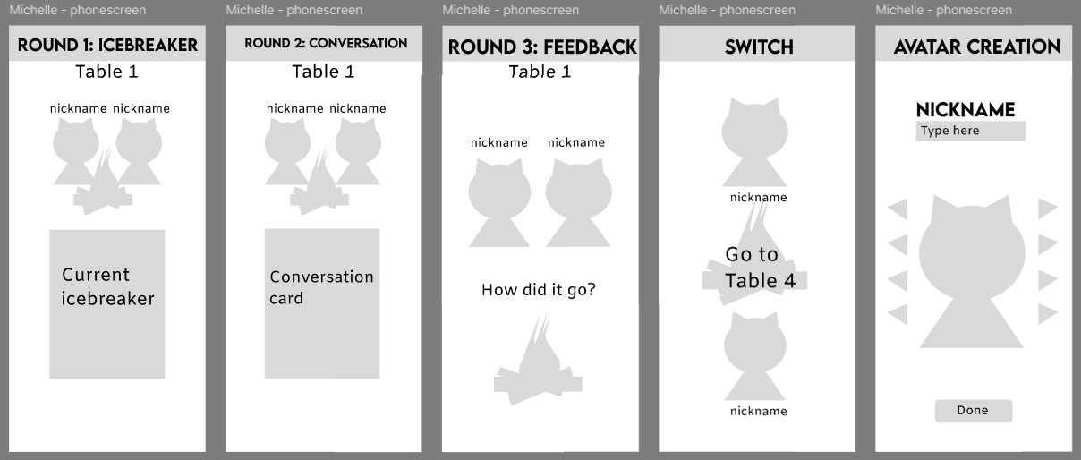
For the phone screen it would also be nice to have the icebreakers and conversation starters
displayed so you can keep the talking bubble around your partner. For this same reason I thought it
would be better if we have the duo avatars displayed on the phone instead of only one. As stated
in my research, an avatar helps shy people feel more at ease so I wanted to add that.
But yeah, this way of making prototypes happened, because at first I was actually making wireframes,
but got confused by another
groupmate who was also making prototypes instead of wireframes.
After this I made the actual wireframes:
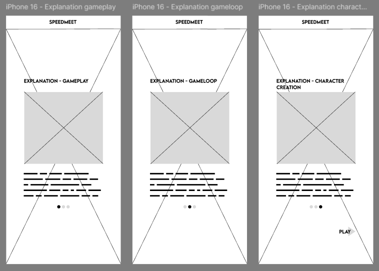
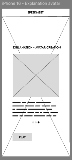
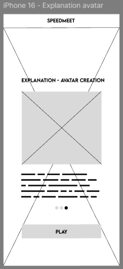
The explanation page:
With variations on the button:
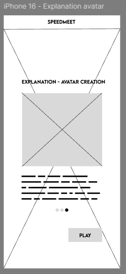
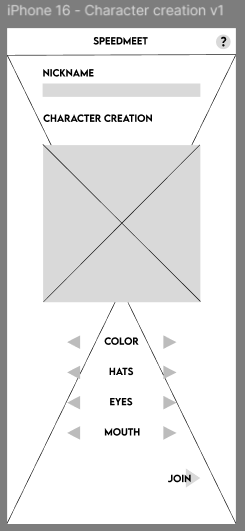
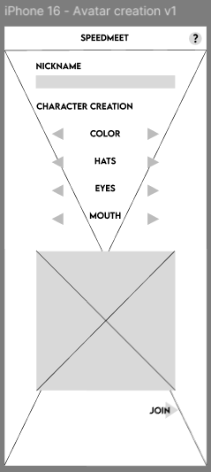
Two variations of the character creation:
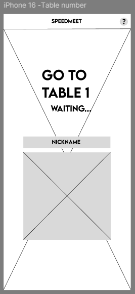
Table number page:
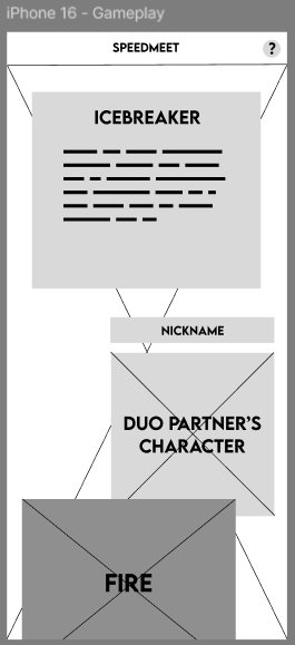
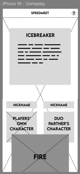
Two variations of the gameplay screen:
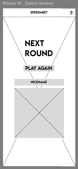
Two variations of the switching tables screen:
As you can see, the structure of my first prototype of the phonescreens were still kept.
After this, me and a groupmate usertested the wireframes and in this document you will find the full
test:
The results are that for the explanation page the last variation was best, for character creation the
first, for the gameplay screen the second and the table switch screen also the second.
Based on this, we made the designs and layout for the prototype.
STARR Reflection
Situation
We needed to design clear and usable interfaces for both phone and big screen gameplay.
Task
My task was to create wireframes and validate their usability.
Action
I created multiple wireframe variations and conducted usability tests with users (DOT: Field –
Usability testing). Based on the feedback, I iterated on the wireframes to improve clarity and
interaction flow (DOT: Lab – Prototyping and iteration).
Result
The final wireframes were more user-friendly and aligned with user needs. This validation process
directly supports LO1 by showing user-centered design decisions.
Reflection
Through this proof, I learned the difference between “what I think is clear” and “what users
actually understand.”
The usability testing made design decisions more objective and helped me defend choices with
evidence.
Next time, I want to define tasks and success criteria more explicitly before testing, so the
results become even more reliable and easier to translate into design improvements.
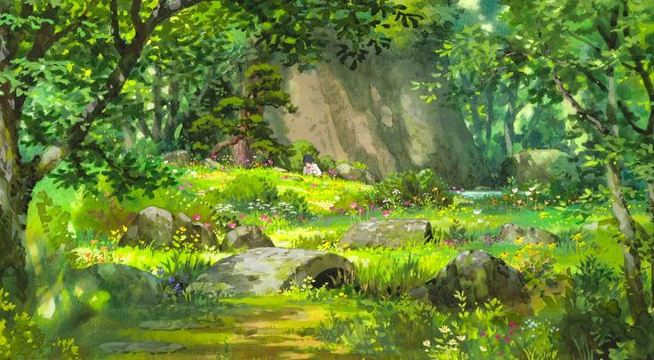
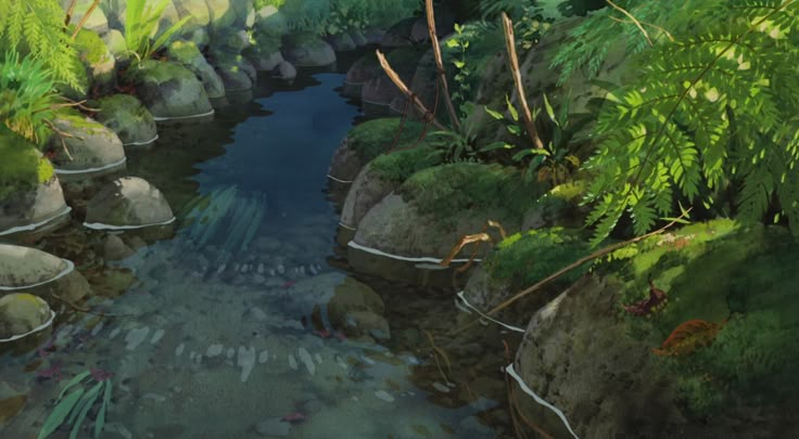
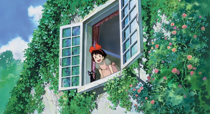
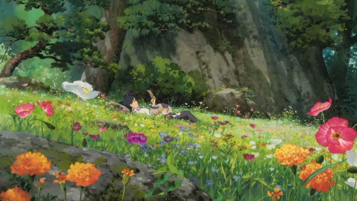
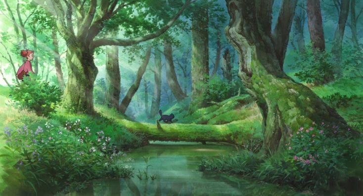
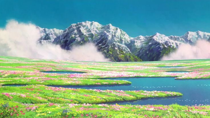
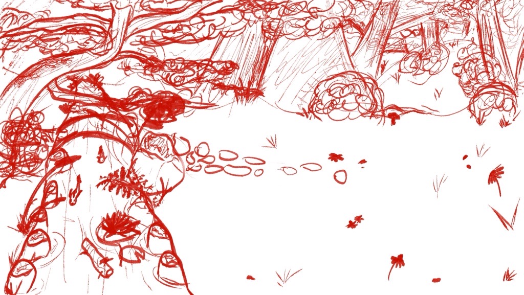
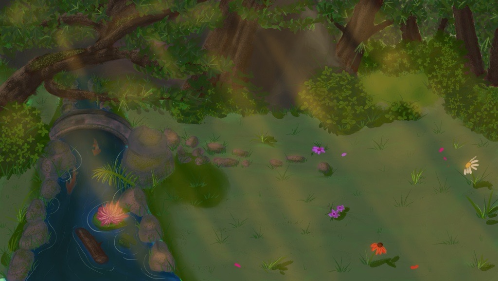
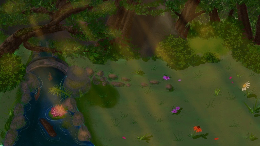
Design background
For the look and feel of our game, we wanted to go with a painted style that’s inspired by studio
Ghibli, because a recent study showed that those movies can help with mental health.
For this I have saved reference pictures on pinterest from various Ghibli movies with
sceneries we wanted to have in our game.
These are the pictures I saved:
This was the first time I had painted such a background and wanted to have enough space for
especially the cats, campfires and icebreakers.
I started by taking a look at the wireframes and tracing them to see where I’d get the most space and
where to place what:
Then I outlined the general sketch for the background:
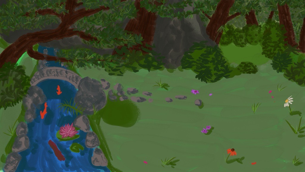
After this I colored it in:
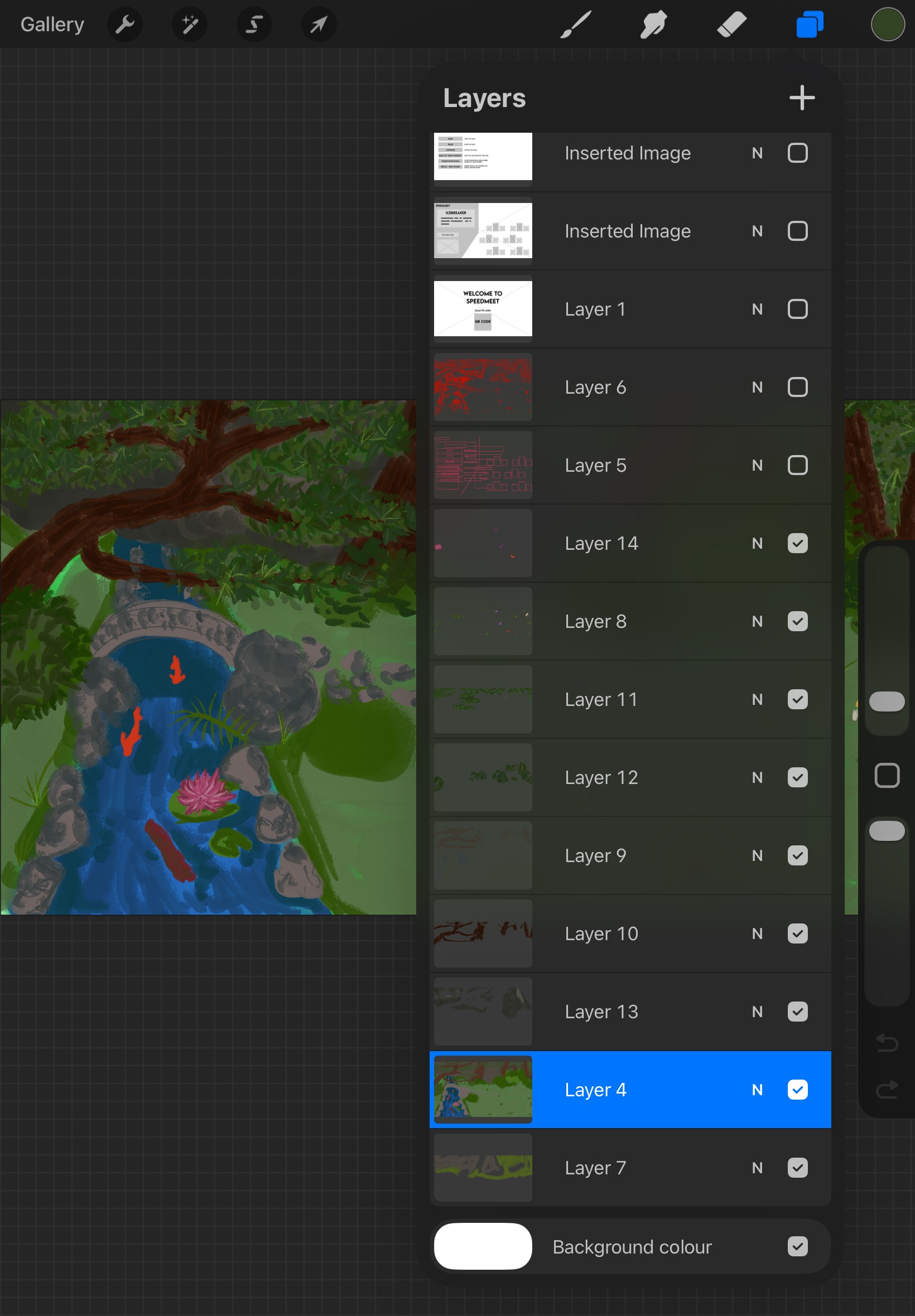
Here you can see how I used the layers to put everything together:
Added more details:
Even more details + lighting:
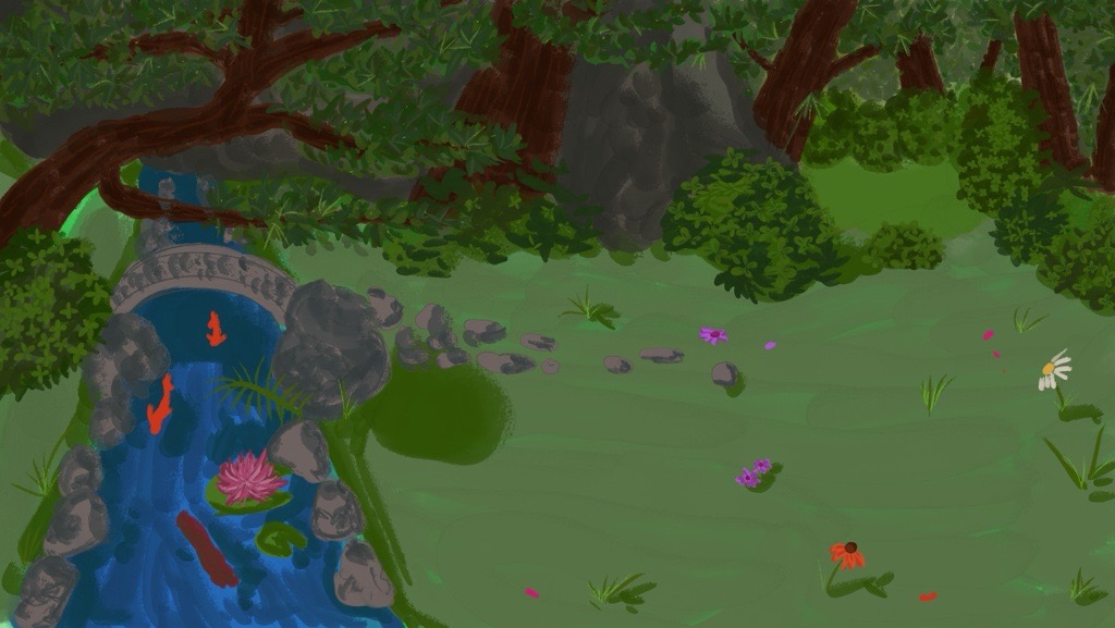
Then I made the painting darker to match the feeling of having the campfires in the evening around
sunset more and this was the final background before the event and we did a usertest with it in the
prototype:
STARR Reflection
Situation
The Speedmeet game required a calming and immersive visual environment.
Task
My task was to design a background that supported interaction without overwhelming users.
Action
I iteratively painted and refined the background while testing readability, contrast, and space for
UI elements within the prototype (DOT: Lab – Component testing).
Result
The final background improved focus and atmosphere during gameplay. This demonstrates how visual
design choices enhance interactive media products, supporting LO1.
Reflection
This was a valuable learning moment because it was my first time painting a large background with
functional space for UI and characters.
I learned that atmosphere is important, but readability and focus are just as critical in an
interactive context.
Next time, I want to test the background earlier in different lighting/contrast levels and validate
readability with more people, so visual decisions are more user-centered and less based on my
personal preference.
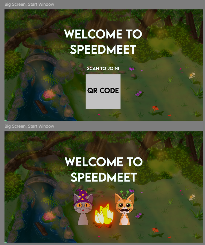
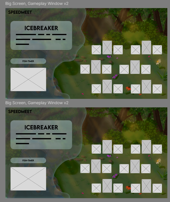
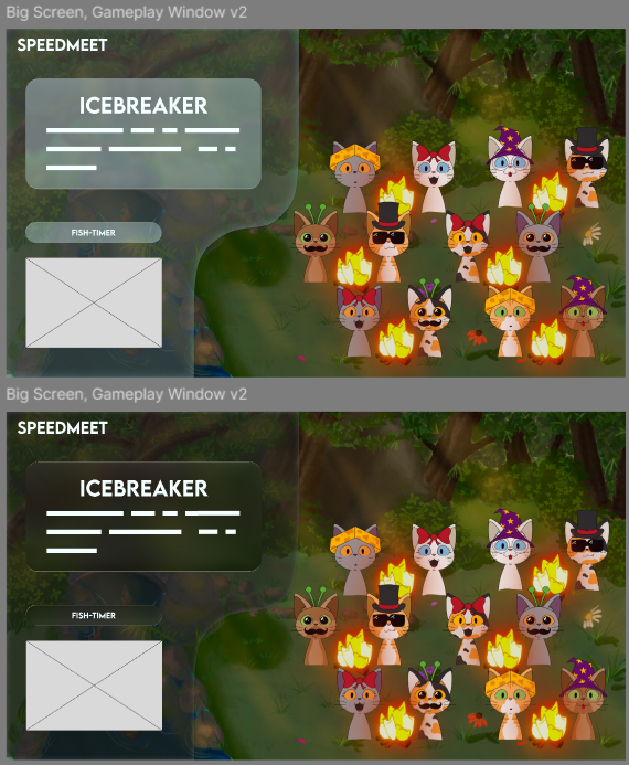
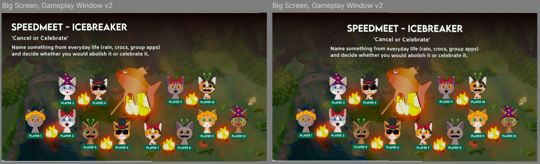
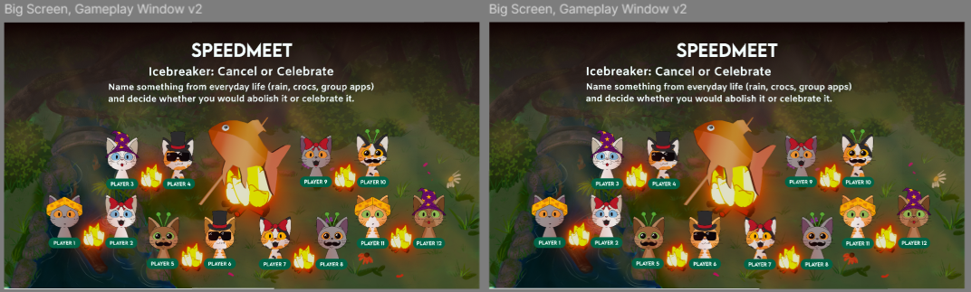
Design prototype big screen
After I did the background, I started making the design for the big screen of the prototype in Figma.
This
serves as the base for the game and I made them based on the wireframes.
For this screen, I changed the QR code to two cats and the campfire, because for the event we
wouldn’t have to let the participants scan the QR code. This was decided after we discussed doing
the Wizard of Oz method at the event during the client meeting.
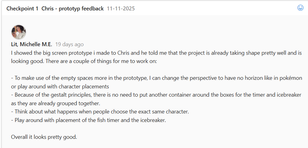
Then I made a some variations with the icebreaker part and started to put in more assets like the
cats
and campfires when they were done:
As you can see, I played a lot with figma’s new glass effect function and wanted to try it out
because it is a trend now with Apple’s new UI
At some point I also added Eline’s fish when she was done to see what the design looks like.
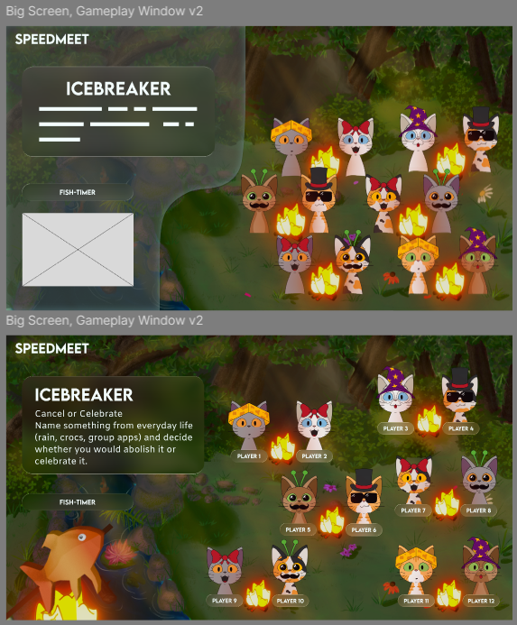
First got feedback from Erem to make the blob more organic and later got feedback from Chris that the
blob wasn’t needed and to play more with the space, so I had implemented both in the above shown
pictures.
The feedback from Chris:
Then made more variations:
Then started to play more with the gradient and placements:
Then I got feedback from Wouter:
The implemented versions afterwards:
Afterwards changed the fish to Elines newest one:
Then made an official one with the changing color of the fish:
I also made all the screens with the cats changing seats for the map:
Afterwards I showed Wouter the latest versions and he said that they looked really good.
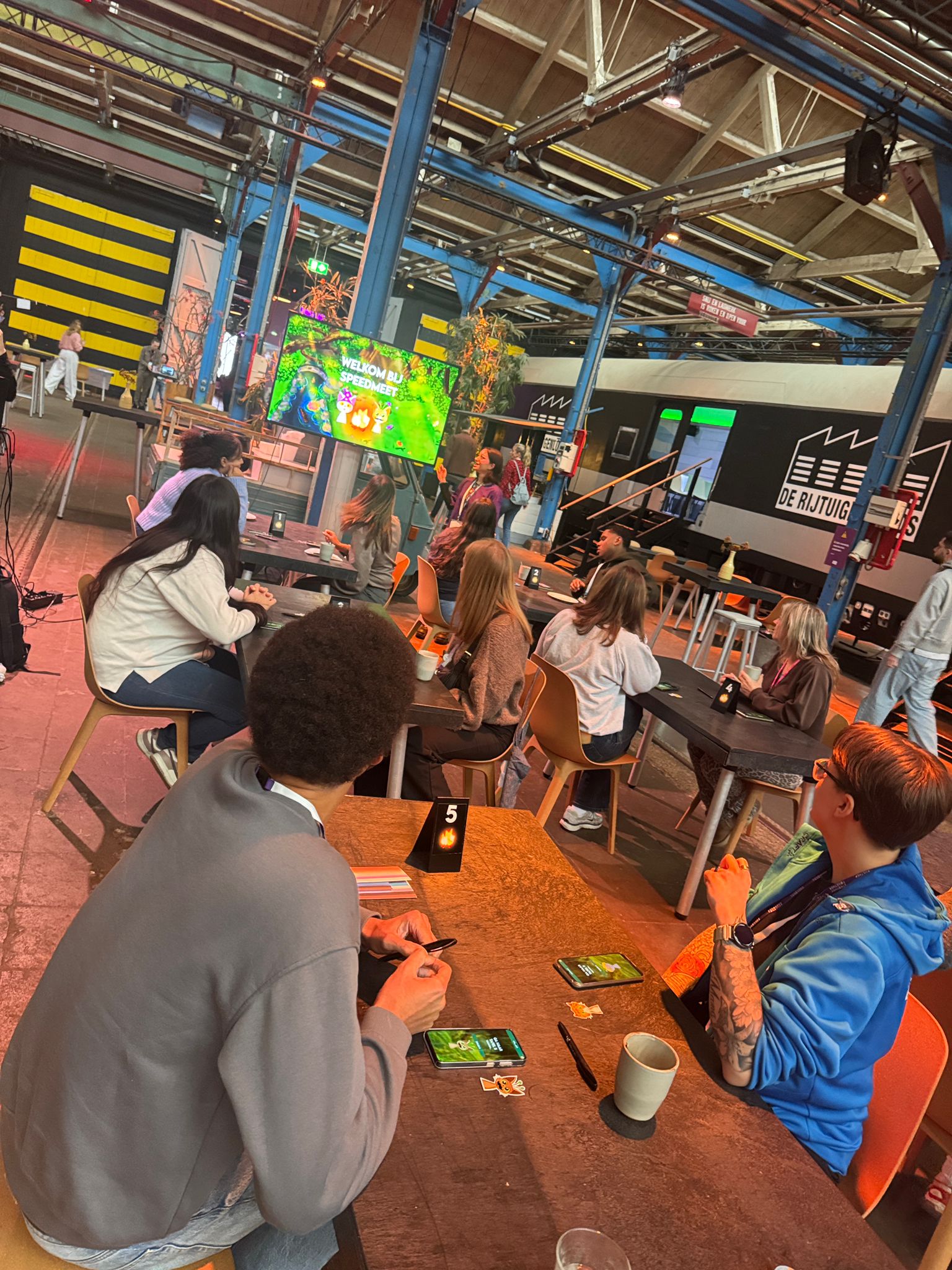
Proof of concepts
We also did a usertest of the prototype before the event at school and these were the results:
Unfortunately we couldn't get any real feedback or testing from our actual target audience because of
the ethical considerations and JoinUs' privacy policy. This is why we tested at the event, because
the people there are all supervisors of our target audience and know them very well.
STARR Reflection
Situation
Before committing to development, the Speedmeet prototype needed validation.
Task
The task was to test whether the concept functioned in a real-world setting.
Action
We tested the prototype during a school event as a proof of concept (DOT: Lab – Proof of concept). I
observed participant behavior and interaction flow during the event (DOT: Field – Observation).
Result
The testing revealed missing elements and areas for improvement, which were implemented afterward.
This validated the concept and supported LO1 through real-world testing.
Reflection
This proof showed me the value of testing in a realistic setting before development.
Observing users gave insights that I would not have found by only designing in Figma.
Because we could not test with the exact target audience, I learned to work responsibly within
ethical constraints while still gathering useful feedback.
Next time, I want to prepare a clearer observation checklist and a short set of questions
beforehand, so the test results become more structured and easier to apply.
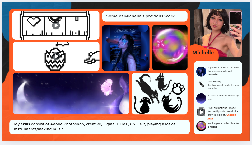
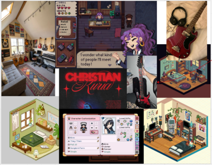
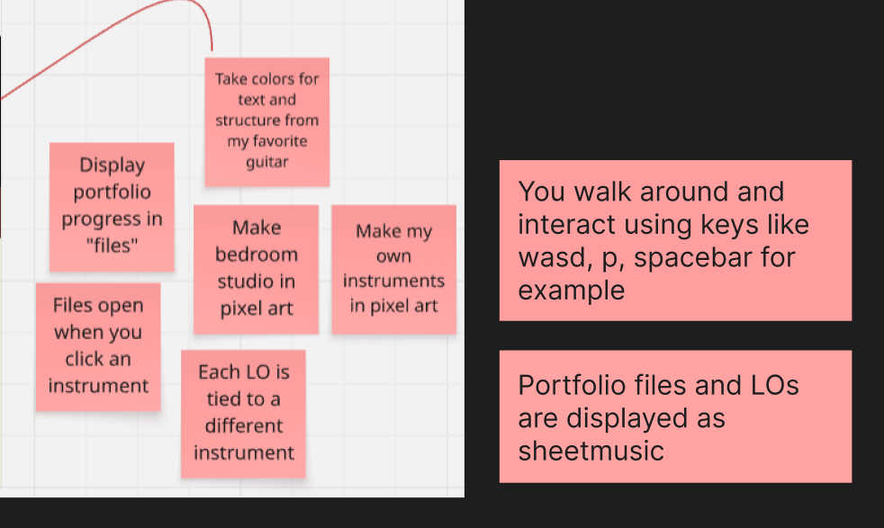
Portfolio concept
I made a moodboard for my portfolio:
I wanted to make a pixel art cozy room/studio where you interact with the instruments to read parts
of my portfolio.
I wrote down more of the concept in sticky notes:
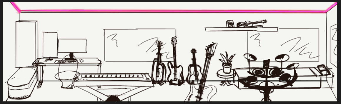
Then I made a quick sketch of what the game would look like:
I wanted to do this in godot as that’s according to a lot of users easier than unreal engine and
others when it comes to 2D games.
When I talked about it with Erem and Dirk, they told me that it would be better if you could read my
whole
portfolio when interacting with an instrument instead of a learning outcome per instrument.
After thinking about it a little more, I feel like the actual game would eventually be more game with
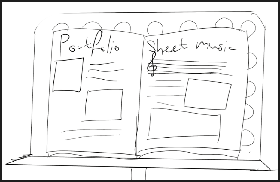
a hint of portfolio, so I’m switching it up to a website, but keeping some components. Like sheet
music flipping for when I have a lot of iterations. Taking the color scheme of one of my instruments
and using that for my website. Still connecting a different instrument to a learning outcome.
What I will be changing is the fact that I want to 3D-model my instruments in blender or sculpt them
on my ipad.
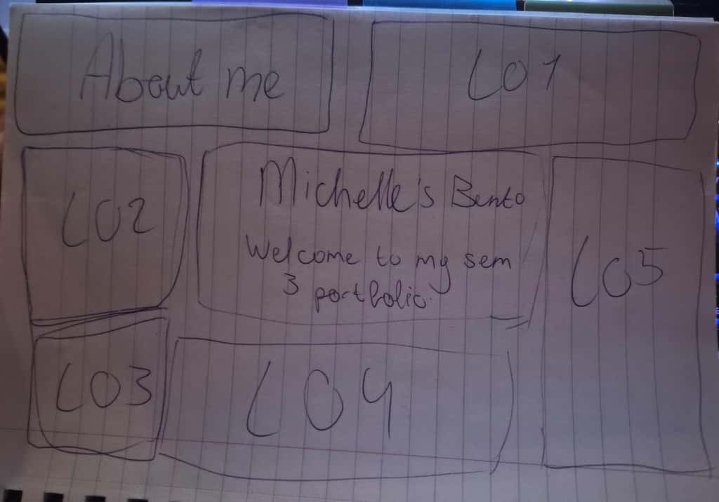
For the homepage I want to make a bento box that displays all of the instruments and connect them to
a learning outcome page.
Here is a sketch of it:
STARR Reflection
Situation
I needed to design a portfolio concept that reflected my identity and work.
Task
The task was to develop an engaging concept while keeping it practical and readable.
Action
I brainstormed multiple concepts and sketched ideas, then refined the concept after receiving
feedback from a lecturer (DOT: Workshop – Brainstorm, Lab – Iteration).
Result
I pivoted to a website-based portfolio while retaining interactive elements. This shows informed
decision-making and conceptual development, supporting LO1.
Reflection
This process helped me understand that a strong concept is not only about creativity, but also about
feasibility and clarity for the audience.
The feedback made me reflect on the balance between “fun interaction” and “communicating my work
effectively.”
Next time, I want to validate the concept earlier by testing a small interactive prototype or
navigation structure, so I can make evidence-based decisions instead of relying mainly on
assumptions.
Audio creation
To enhance the vibe of an actual campfire, I put together an audio that replicates the sound of a
campfire. For this I looked up some YouTube tutorials, applied some techniques from Wouter’s Ableton
workshop and gave it my own twist. What I used was the Presonus studio set which includes cabled
headphones, an audiobox and a microphone. I recorded sounds from scrunching my headphones baggie,
slowly
ripping some Velcro for the popping sound and blowing into the mic softly for the fire. Then I
adjusted
the bass, reverb and volume levels. We also tested it out at the event of joinus but we only heard
it
when it was more quiet as it was very noisy. I will test it out more with a speaker at school.
Here is the audio:
STARR Reflection
Situation
To enhance the atmosphere of our Speedmeet prototype, we wanted an audio element that realistically
supports the campfire setting and helps create a calm, cozy mood during gameplay.
Task
My task was to create an original campfire audio loop using my own equipment, apply relevant audio
techniques, and test whether the sound worked in the prototype context.
Action
I used the PreSonus studio set (AudioBox and microphone) to record my own source sounds, such as
softly blowing into the microphone for the “fire” base layer, scrunching a headphones bag for
texture, and slowly ripping Velcro for popping/crackling effects.
I then edited and mixed the recordings by adjusting bass, reverb, and volume levels to make the
sound feel natural and immersive.
To learn and improve the technique, I watched tutorials and applied approaches from Wouter’s Ableton
workshop (DOT: Workshop), then experimented with my own variations while mixing and balancing the
layers (DOT: Lab – experimentation/iteration).
Finally, we tested the audio during the JoinUs event to check how it translated to a real
environment, and I observed how audible and noticeable it was in a noisy space (DOT: Field –
observation in context).
Result
The audio successfully contributed to the campfire vibe and made the prototype feel more immersive.
During the JoinUs event, we noticed that the audio was harder to hear due to the overall noise
level, which showed that testing in real conditions is essential. This proof supports LO1 because it
demonstrates creating and integrating an interactive media component that improves the overall
experience and atmosphere.
Reflection
This task taught me that sound design is not only about creating a nice loop, but also about
validating it in the real context where it will be used. I learned that the same mix can feel
perfect on headphones but become too subtle in a crowded environment. Next time, I will create
multiple versions (for example: quiet room vs. event/noisy space), test on different speakers, and
collect short user feedback on whether the audio supports the experience without becoming
distracting.