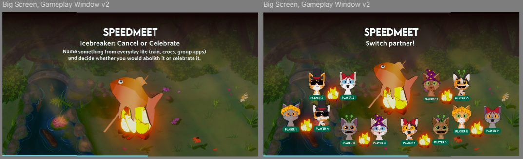
Logos
I worked on some logo sketches and iterated on them with feedback.
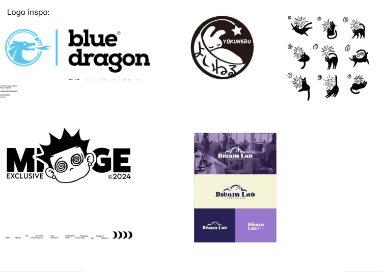
I took inspiration from the logos and illustrations below:
Then made these 3 logo sketches first. What I wanted to convey in the logos was the playfullness, cats
and an item that has something to so with design or creativity. So I made variations with the cat tail,
a ball of yarn and laser pointers:
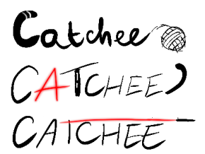
I asked the group for feedback, Tina told me that she thought the stripes in the C of the first one was a
nice touch as cat’s tail, but it was too much petstore.
Erem said the third one looked more like a lightsaber and the A in the second one would be hard to see as
light.
Afterwards I made these 3:
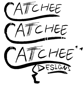
I kept the stripes in the tail but wanted to make a few versions where it was an actual tail. The T
scratched by a cat. Putting the “designs” in the body and hiding a pencil.
But the feedback I got from the group was that it was just a lot for a logo.
So I made a last one where I still kept the C as the tail and made a cat hold on to the pencil:
The feedback I got from Erem was that it’s just not a good idea to make the first letter not an actual
letter and people would read it as Atchee. But it looked creative.
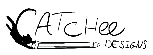
Another groupmate took inspiration from this idea and made her own version, but it contained one of the
inspo
illustrations, so I made our own illustration of it for in her logo. The second one is with my take on
the cat:
Link
to brand figma logos
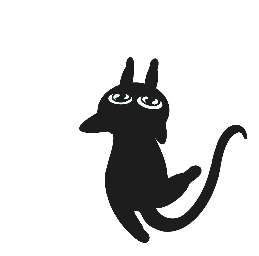
The last logo sparked an inspiration in me to create cat illustrations for the brand.
STARR Reflection
Situation
For our agency branding, we needed a logo that communicated playfulness, cats, and creativity while
still being readable and professional.
Task
My task was to explore multiple logo directions and iterate based on team feedback until the concept was
strong enough to build on.
Action
I started with inspiration research by analyzing existing logos and illustrations to understand styles
and composition ideas
(DOT: Library – Inspiration research / Best, good and bad practices).
I sketched several logo variations (cat tail, yarn, laser pointer) and asked my teammates for feedback
after each round
(DOT: Workshop – Feedback session / Brainstorm).
Based on feedback about readability and associations (e.g., “petstore feeling,” letters becoming
unclear), I simplified and refined the designs across multiple iterations.
When a teammate used an external illustration reference, I created our own cat illustration to keep the
branding original and consistent (DOT: Lab – Visual iteration).
Result
The iterative process resulted in clearer insights about what did and did not work for our brand
identity.
It also sparked the direction of developing custom cat illustrations, which became a recognizable brand
element.
Reflection
This proof taught me that a logo concept can be creative, but must remain readable at first glance.
Next time, I want to test early logo sketches in different sizes and contexts (favicon, poster, header)
before refining details, so usability and scalability are validated earlier.
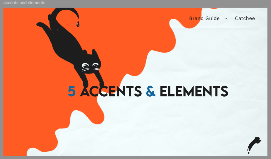
Brand elements
I made the elements part and illustrations for our brand and iterated on them with feedback.
Here are the accents and elements pages:
Link
to brand figma accents and elements
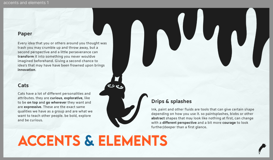
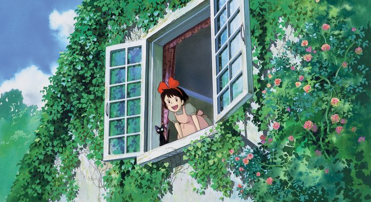
When I started the illustrations, I took some inspiration from the cats on Tina’s stylescape:
They were black cats and I wanted to make it look like they were made from ink.
I had to export these, the blobs and drips again via teams and the onedrive, because I at first exported
them in Discord, which messed up the quality.
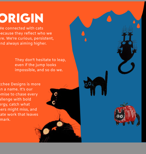
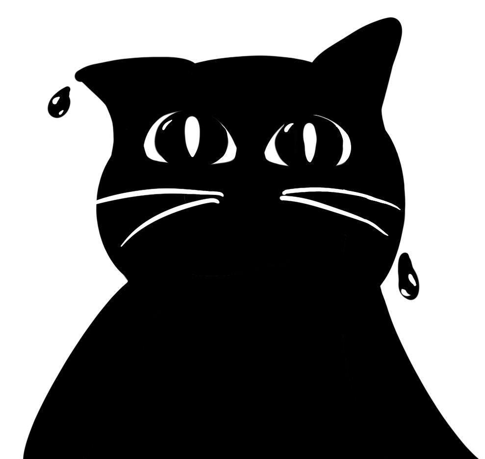
So this is how I started one of the cats looking from above:
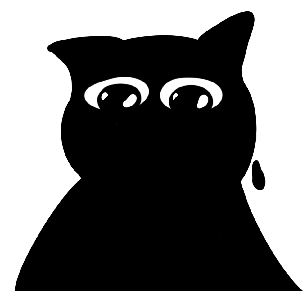
Erem’s feedback was that he looked too sad instead of down and he looked sweaty.Erem’s feedback was that
he looked too sad instead of down and he looked sweaty.
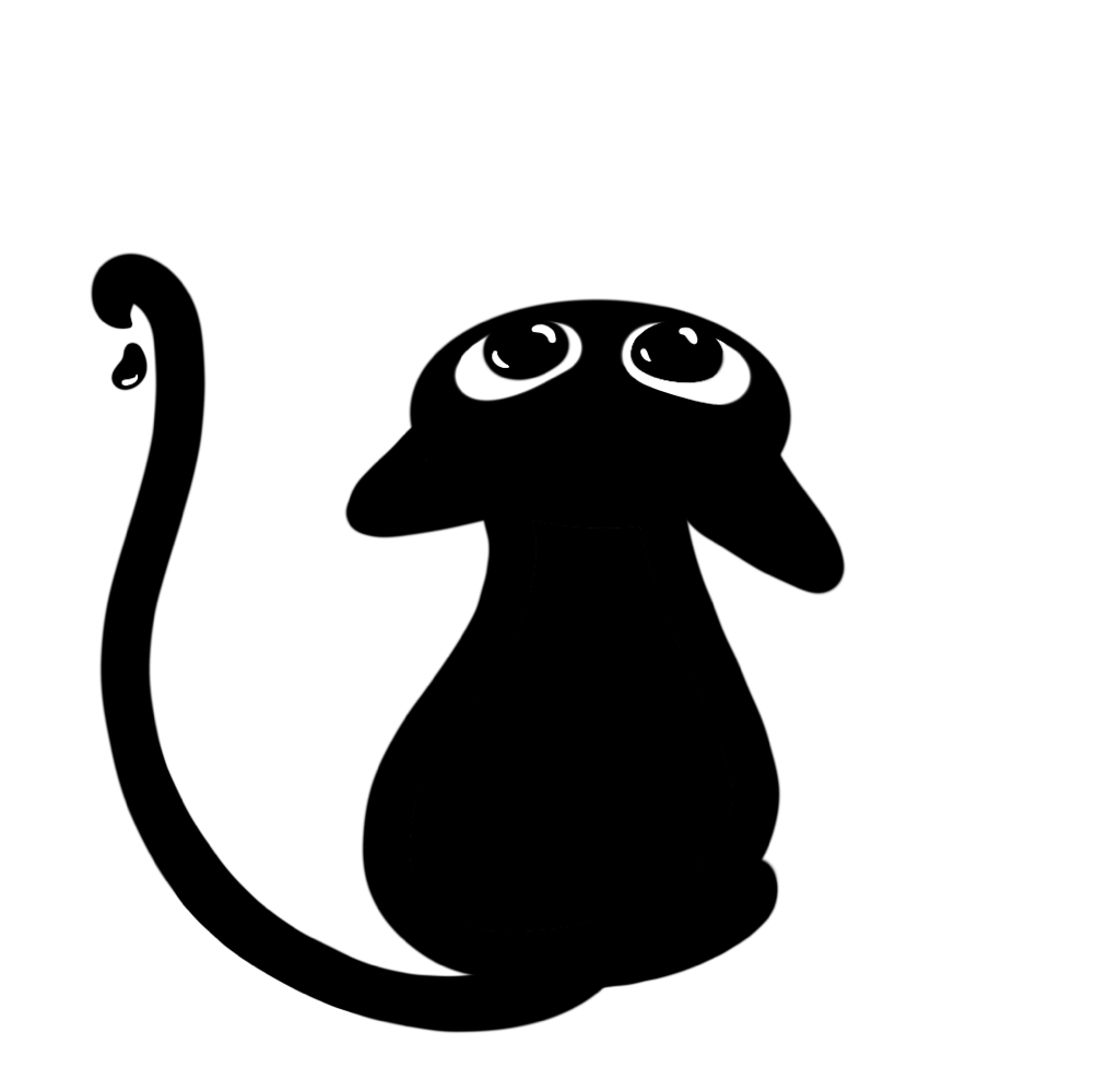
So I iterated and changed his eyes to be more menacingly, gave him whiskers and added shine to the
droplet:
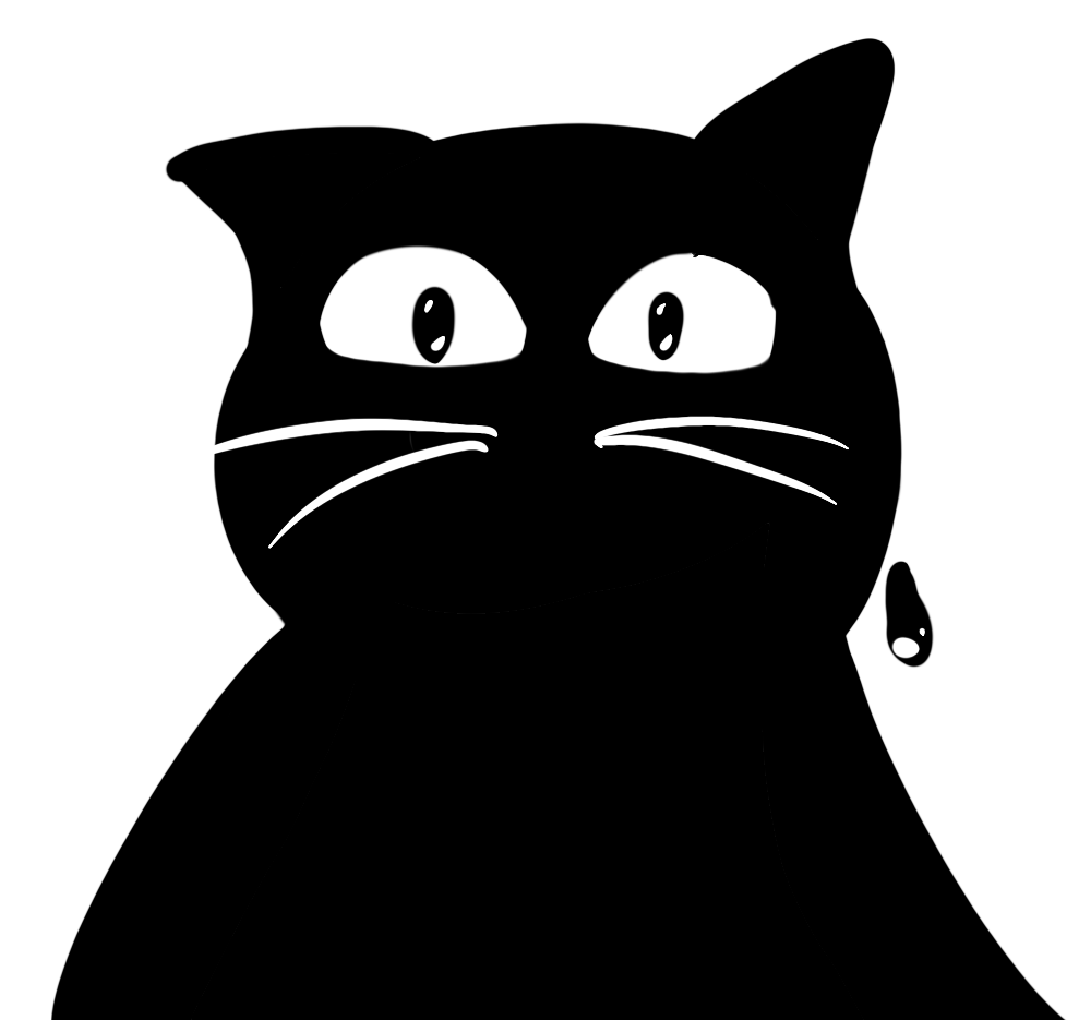
Tho Erem’s feedback was that this one looked too crazy for our brandguide.
So I iterated again, made the pupils bigger to make him less crazy and added another ink droplet:
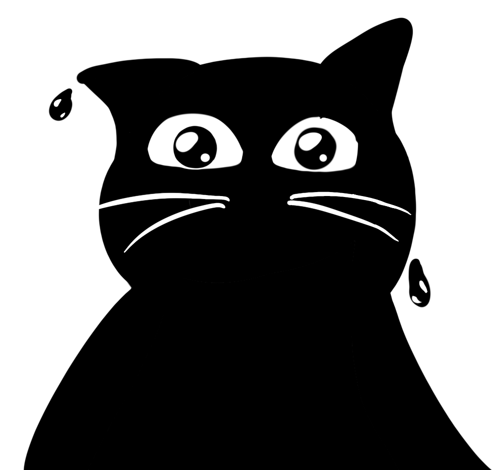
Again still looked too crazy to use when I checked with Erem.
So I made a last iteration to make him appear friendlier and made his eyes even bigger:
But in the end I just discarded it because it just didn’t fit with the rest of the blobby cats.
Link
to brand figma illustrations
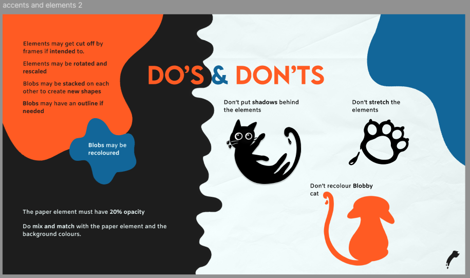
I also made this paw in procreate:
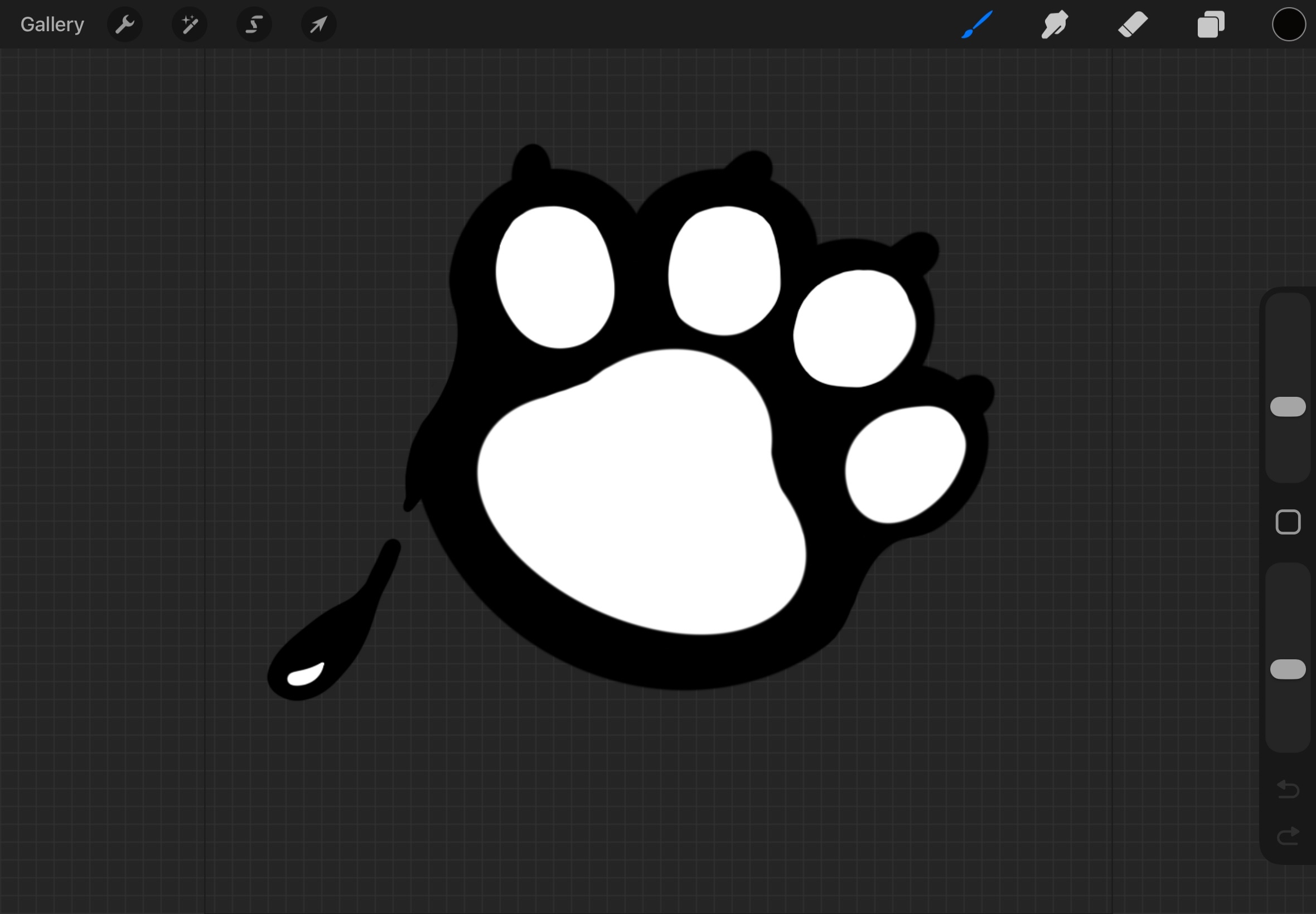
As you can see the cushions are white, so Erem asked me to make them transparent.
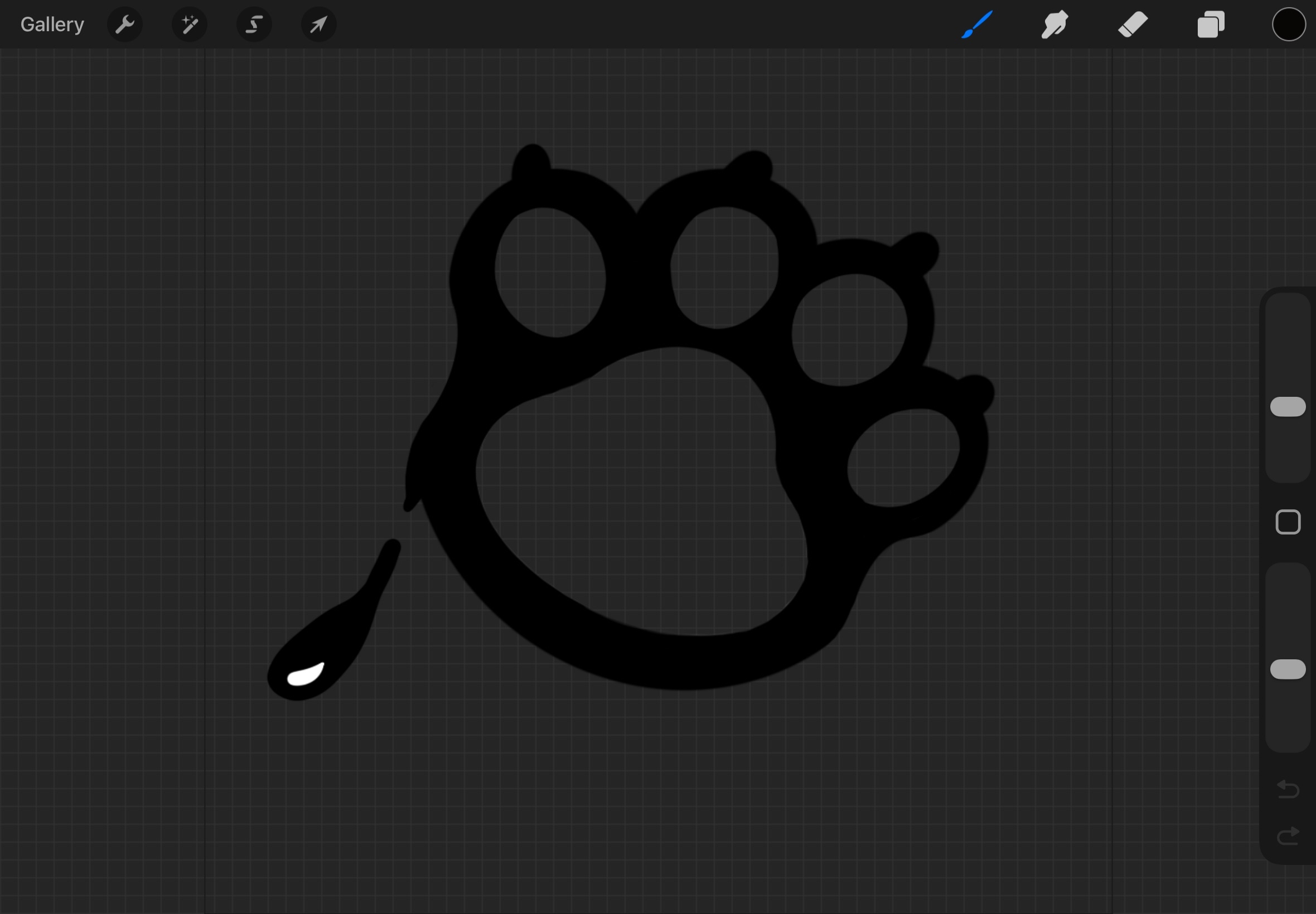
So here it is again but transparent inside:
STARR Reflection
Situation
To support the Catchee identity, we needed consistent brand elements and illustrations that could be
reused across the brand guide and promotional materials.
Task
My task was to create brand elements and illustrations and iterate on them based on feedback until they
matched the desired tone of the brand.
Action
I created accent and element pages for the brand guide and designed a set of ink-like “blobby” cats and
shapes.
I used a teammate’s stylescape as a starting reference for the mood and style direction (DOT: Library –
Inspiration research).
During the illustration process, I regularly asked for feedback from Erem and iterated multiple times on
expressions and shapes
(DOT: Workshop – Feedback session).
For example, I adjusted eye shapes, pupils, whiskers, and shine details to control the emotional tone,
and discarded iterations that did not fit the overall set (DOT: Lab – Iteration).
I also improved my export workflow by switching from Discord to Teams/OneDrive to prevent image quality
loss, making the assets more professional and transferable.
Result
The final set of brand elements and illustrations matched the style direction and could be used
consistently in multiple deliverables.
Discarding the “cat looking down” iterations also helped maintain coherence across the illustration set.
Reflection
This taught me that iteration is not only about improving a single asset, but also about protecting
consistency across a full system.
Next time, I want to define clearer style rules early (line weight, eye style, shape language, mood
range), so fewer iterations are needed and feedback becomes more targeted.
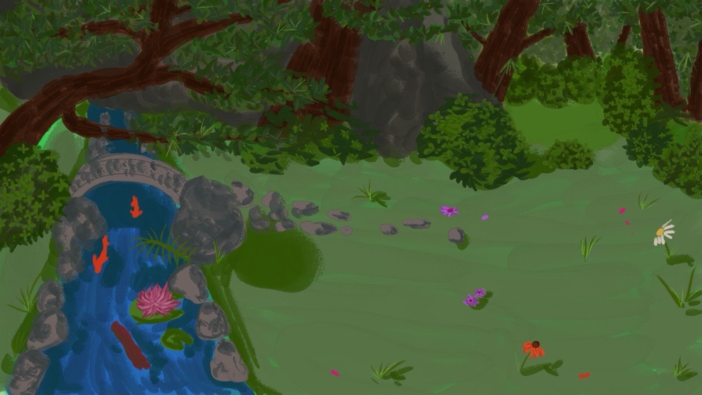
Sketching DND magical forest
The group divided tasks around further concepting for the three themes and idea’s I came up with and
I was going to sketch the magical forest for DND. I made this in Procreate.
I started with making the composition of the forest and started to color it in:
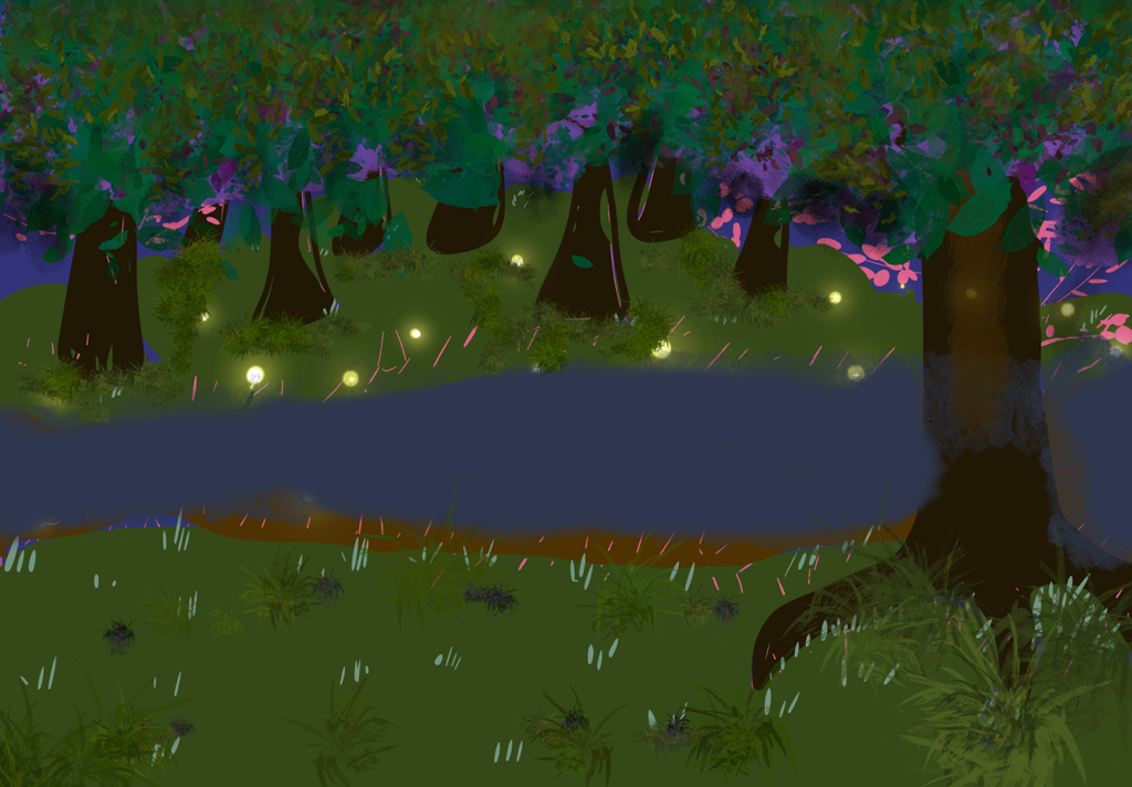
Then I asked feedback from Hanna to ask about the painting. Her feedback was to put more detail in the
trees and grass first and afterwards the water.
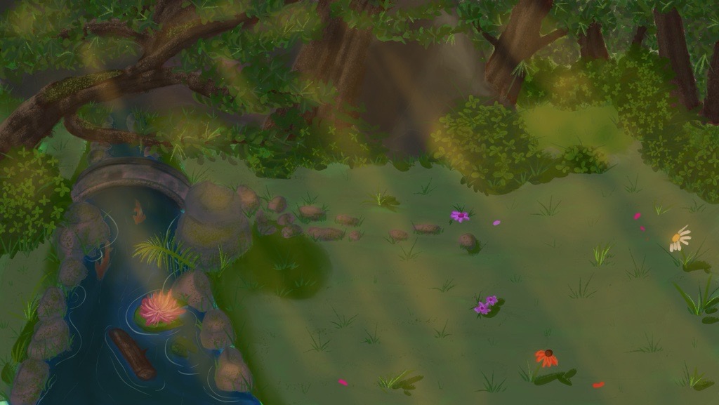
So that's what I did:
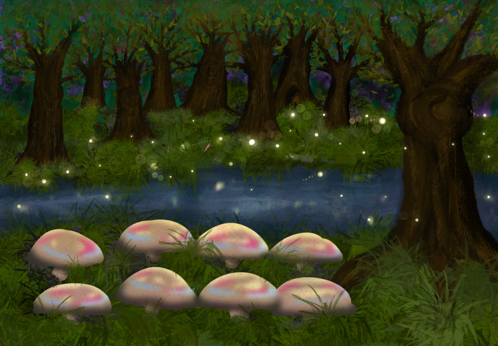
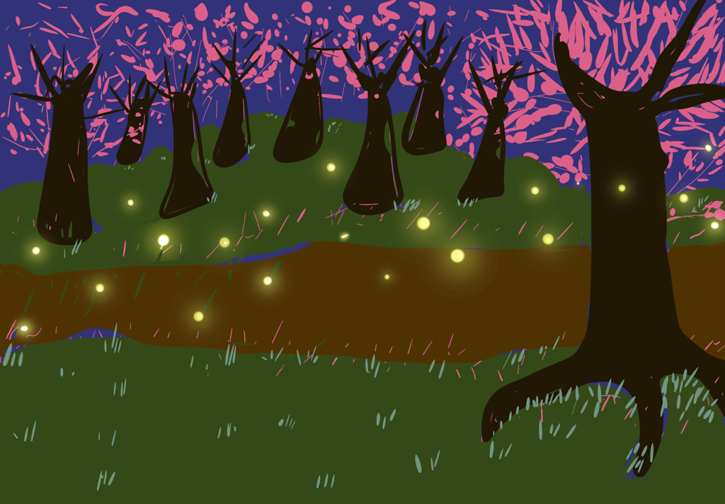
Then I showed it to her again and this time the feedback was that it was almost good, but just needed
extra darkness for the fireflies to pop out.
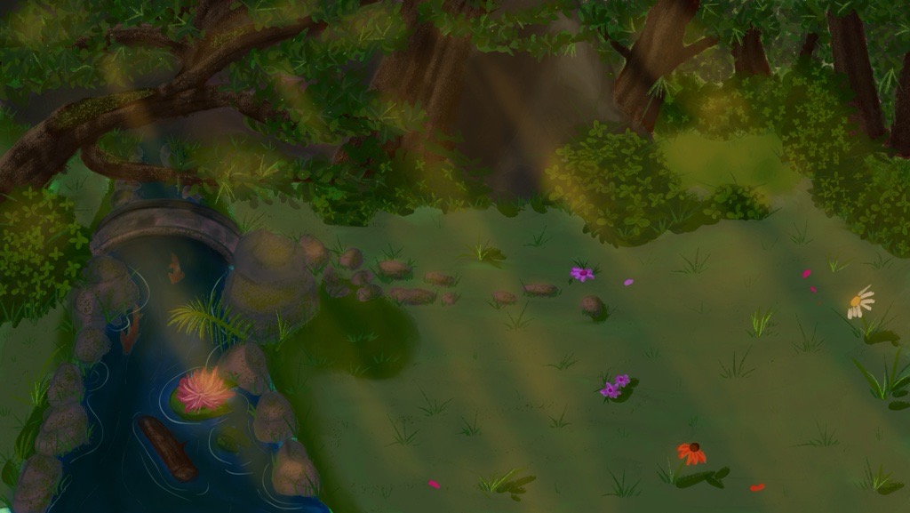
This was the final sketch:
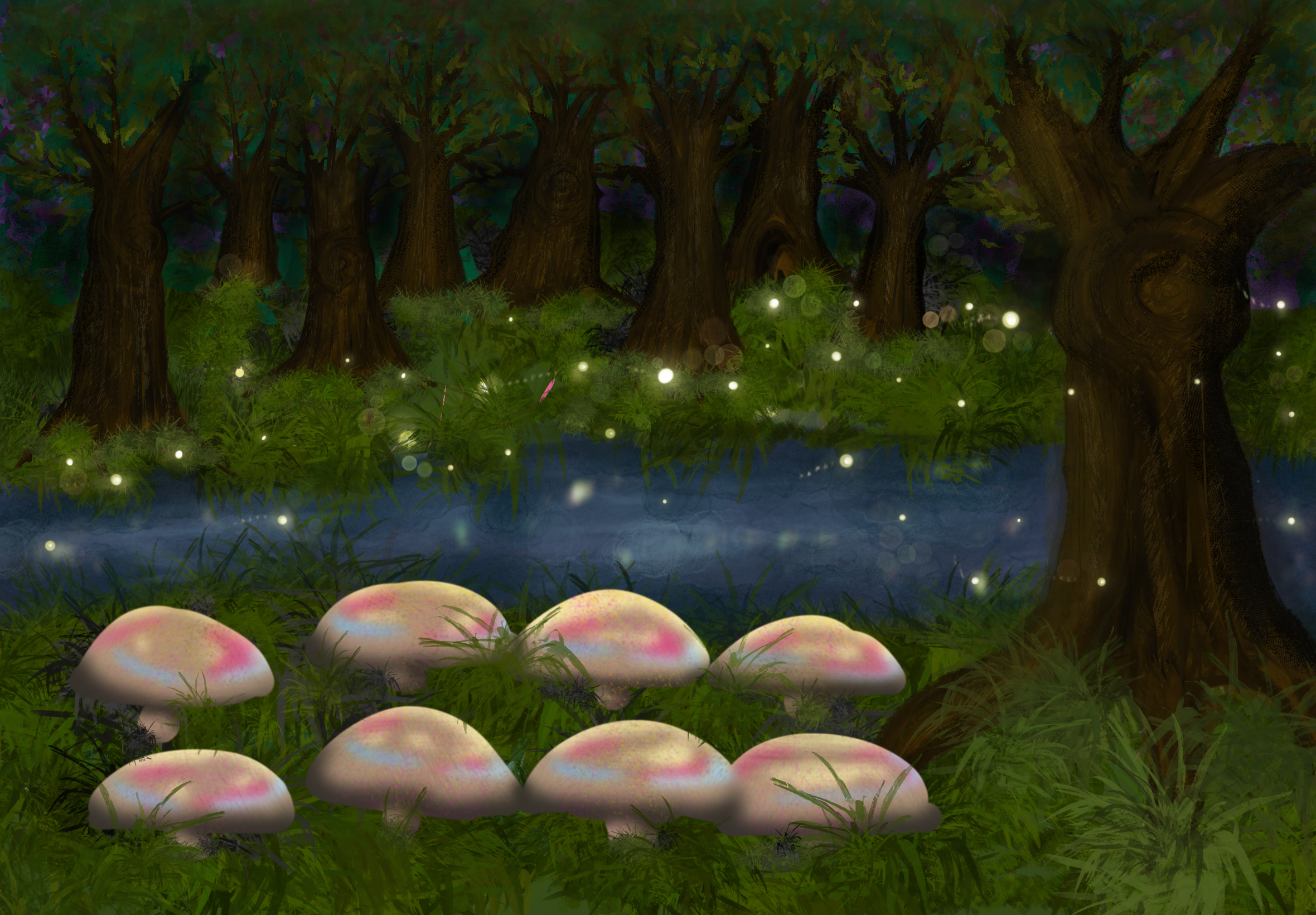
Then I showed her again and she really liked it. But as I was working on this, there was apparently a
decision to do the
lakeside concept I came up with, but a variation to focus more on the campfire part of it.
STARR Reflection
Situation
During concept development, multiple themes were explored for the Speedmeet game, including a
DND-inspired magical forest environment.
Task
My task was to sketch and paint the magical forest concept and improve it through feedback-based
iteration.
Action
I started by setting up the composition and base colors in Procreate and then refined the environment
step by step.
I asked Hanna for feedback during the process and applied her suggestions, such as adding more detail to
trees and grass before focusing on water, and increasing darkness to make the fireflies pop out
(DOT: Field – Expert feedback / Interview-style feedback).
Each feedback round led to a clear design change, resulting in visible, progressive iterations (DOT: Lab
– Iteration).
Result
The final sketch successfully communicated a magical atmosphere and functional ideas (such as using
fireflies for timing or text).
Although the team later shifted concept direction, the iterative process itself was strong and
demonstrated methodical improvement.
Reflection
This proof taught me that feedback is most valuable when I ask it at the right moments, not only at the
end.
Next time, I want to define a small checklist (composition, readability, focal points, contrast) to
structure my iteration cycle and reduce trial-and-error.
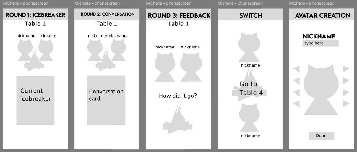
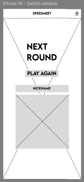
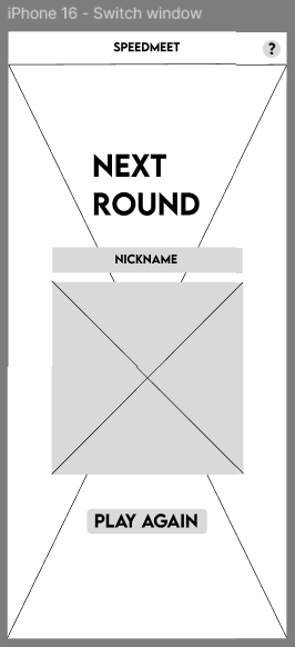
Wireframes Speedmeet
I made some wireframes for the big screen and the phone screen, but heard from Chris that they we
more prototypes than wireframes. Below you can see them:
This happened, because at first I was actually making wireframes, but got confused by another
groupmate who was also making prototypes instead of wireframes.
After this I made the actual wireframes:
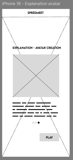
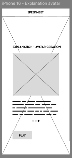
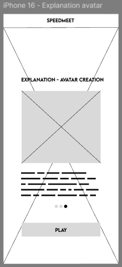
The explanation page:
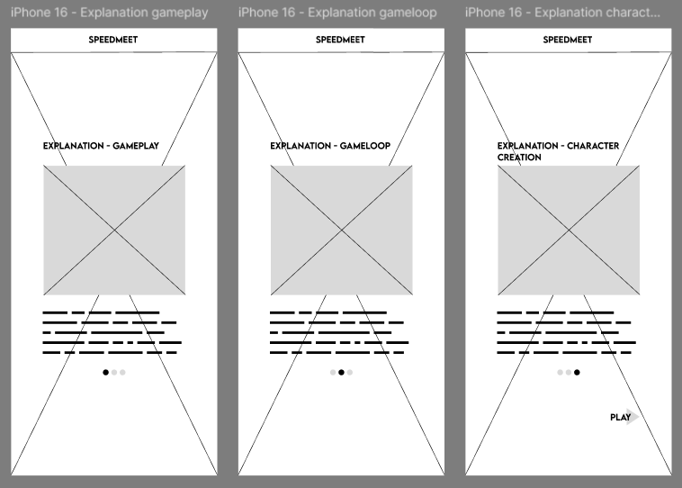
With variations on the button:
Two variations of the character creation:
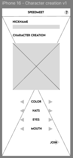
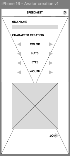
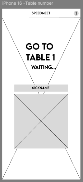
Table number page:
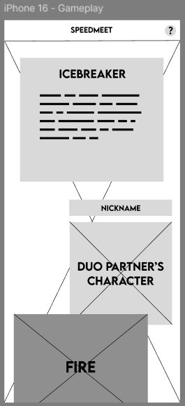
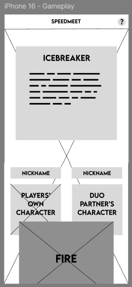
Two variations of the gameplay screen:
Two variations of the switching tables screen:
After this, me and a groupmate usertested the wireframes and in this document you will find the full
test:
Usertest Wireframes
The results are that for the explanation page the last variation was best, for character creation the
first, for the gameplay screen the second and the table switch screen also the second.
Based on this, we made the designs and layout for the prototype.
STARR Reflection
Situation
We needed a clear structure for both the big screen and phone screens, and my early wireframes were
influenced by inconsistent definitions of “wireframes” within the team.
Task
My task was to create correct wireframes with variations and validate which version worked best through
testing.
Action
After realizing the confusion, I redesigned the wireframes with clearer UI structure and created
multiple variations (button placement, character creation layout, phone gameplay layout, and table
switching screens).
Together with a teammate, I conducted usability testing on the wireframes and documented the outcomes
(DOT: Field – Usability testing).
Based on the test results, I selected the strongest variations and used them to inform the final
prototype layout (DOT: Lab – Iteration).
Result
The wireframe testing led to evidence-based decisions about layout and interaction flow.
This strengthened the connection between iterations and final design choices, supporting LO3.
Reflection
This process taught me that iteration becomes more credible when it is supported by test evidence.
Next time, I want to define user tasks more explicitly before testing (e.g., “find your table number,”
“start a round”), so feedback is easier to interpret and compare across variations.
Design painting
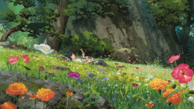
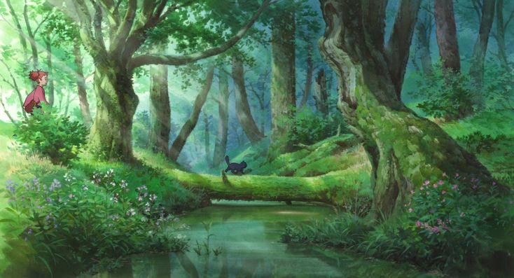
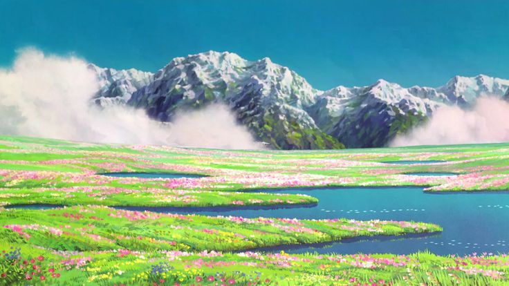
For the look and feel of our game, we wanted to go with a painted style that’s inspired by studio
Ghibli. For this I have saved reference pictures on pinterest from various Ghibli movies with
sceneries we wanted to have in our game.
These are the pictures I saved:
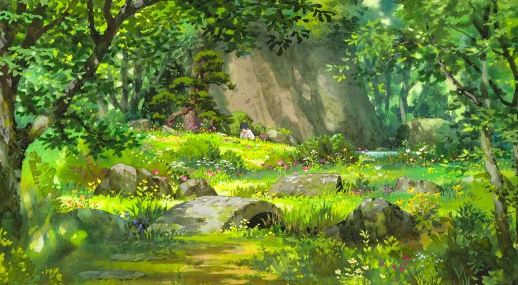
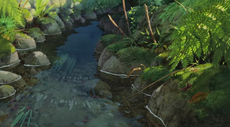
After sketching and coloring in procreate, this is what I ended up with first:
I got feedback from Hanna Cismada that it needed more details and light, but she liked the composition.
Hanna is very good at digital art.
So I added more details and lighting:
So I showed her again and told her about the concept, so she suggested making the painting darker as if
it is at sunset.
Then I made the painting darker to match the feeling of having the campfires in the evening around
sunset more and this was the final background before the event:
I showed it to her again and she said that this one does the job.
The background was also validated during the usertests of the prototype
STARR Reflection
Situation
For the Speedmeet prototype, we needed a painted environment inspired by Studio Ghibli that supported a
calm mood without reducing readability for UI and characters.
Task
My task was to create a background painting and improve it through iterative feedback until it matched
the intended atmosphere.
Action
I collected visual references from Ghibli scenes to guide lighting, color mood, and composition
(DOT: Library – Inspiration research).
I created an initial painted version in Procreate and requested feedback from Hanna, who has strong
digital art skills
(DOT: Field – Expert feedback).
Based on her feedback, I added more detail and lighting, then adjusted the overall tone to a darker
sunset mood to support the campfire setting.
I validated the result by integrating it into the prototype and using it during user tests (DOT: Lab –
Iteration + Component testing).
Result
The final background supported the intended atmosphere and functioned well in the prototype context.
The iterative steps clearly show how feedback improved the quality and usability of the design.
Reflection
This taught me that environment art for interactive media must balance atmosphere with functional
readability.
Next time, I want to test contrast and UI visibility earlier by placing placeholder UI elements on top
of the background during painting, so usability is validated throughout the process.
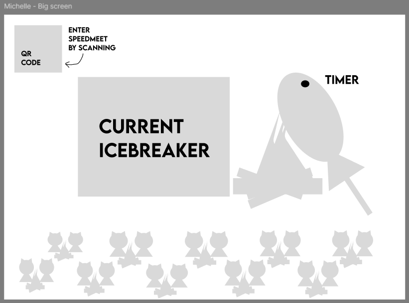
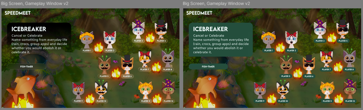
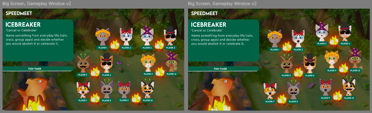
Design prototype big screen
After I did the background, I started making the design for the big screen of the prototype. This
serves as the base for the game and I made them based on the wireframes.
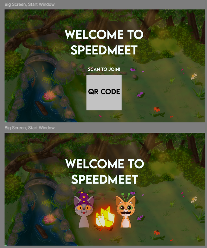
For this screen, I changed the QR code to two cats and the campfire, because for the event we
wouldn’t have to let the participants scan the QR code. This was decided after we discussed doing
the Wizard of Oz method at the event during the client meeting.
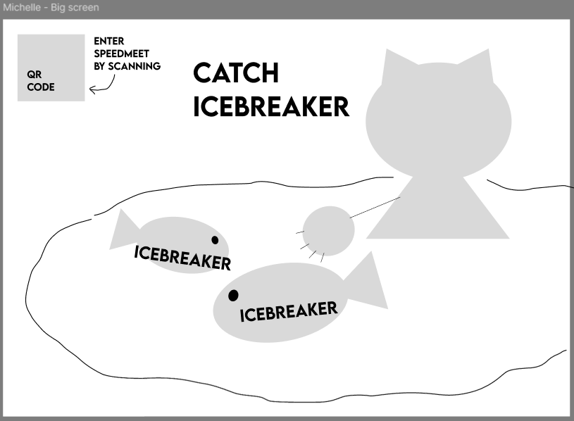
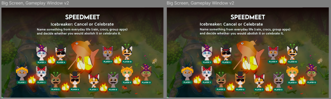
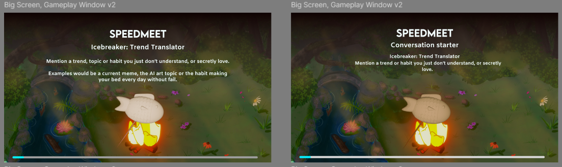
Then I started with making some variations with the icebreaker part and started to put in more assets
like the cats
and campfires when they were done:
As you can see, I played a lot with figma’s new glass effect function and wanted to try it out
because it is a trend now with Apple’s new UI
At some point I also added Eline’s fish when she was done to see what the design looks like.
First got feedback from Erem to make the blob more organic and later got feedback from Chris that the
blob wasn’t needed and to play more with the space, so I had implemented both.
The feedback from Chris:
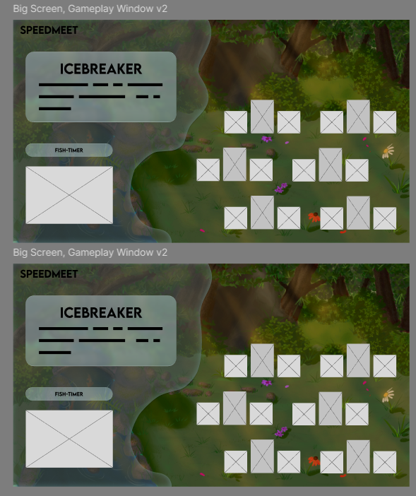
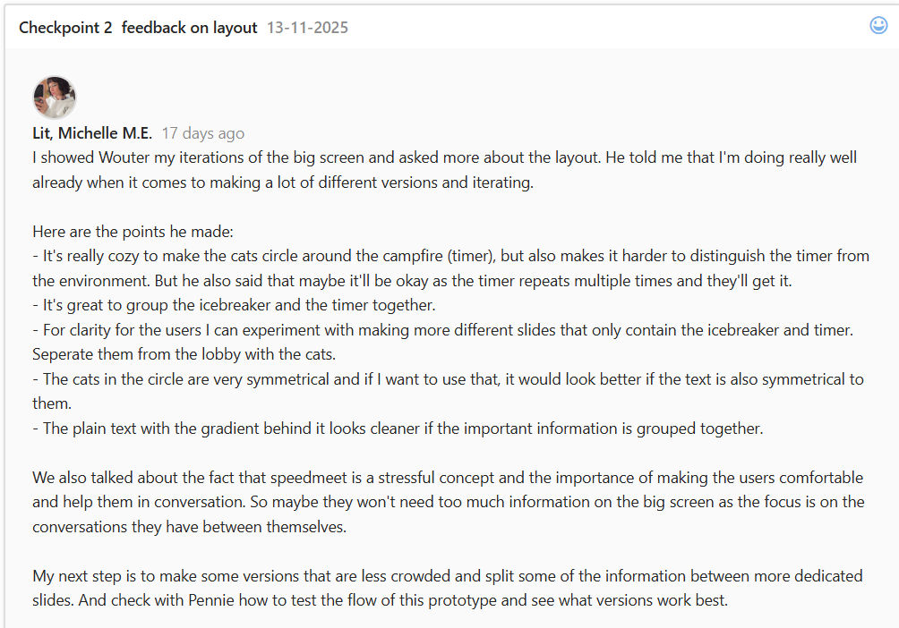
Then made more variations based on the feedback from Chris and the Gestallt principles:
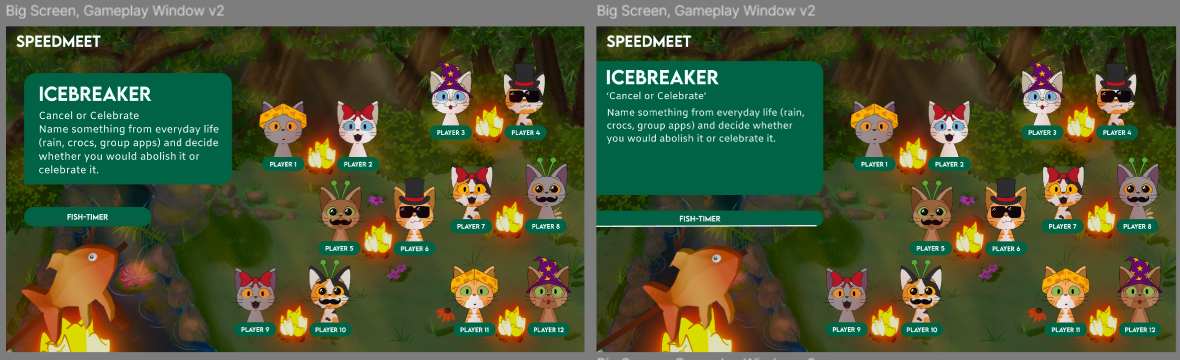
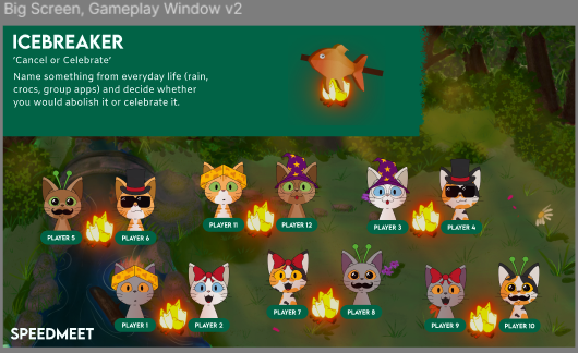
Then I showed Chris again and there were still too many boxes so I changed the box to a gradient and
played some more with placements:
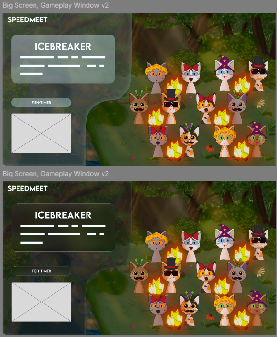
Then I got feedback from Wouter:
The implemented versions afterwards:
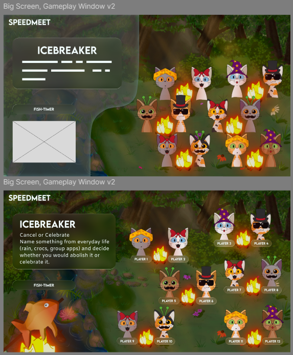
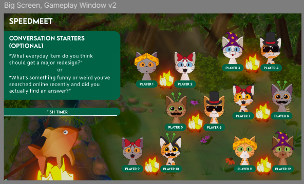
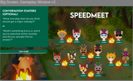
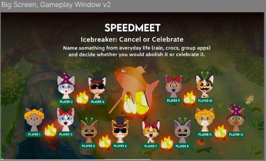
Then made an official one with the changing color of Elines newest fish, because that was still missing
in the prototype:
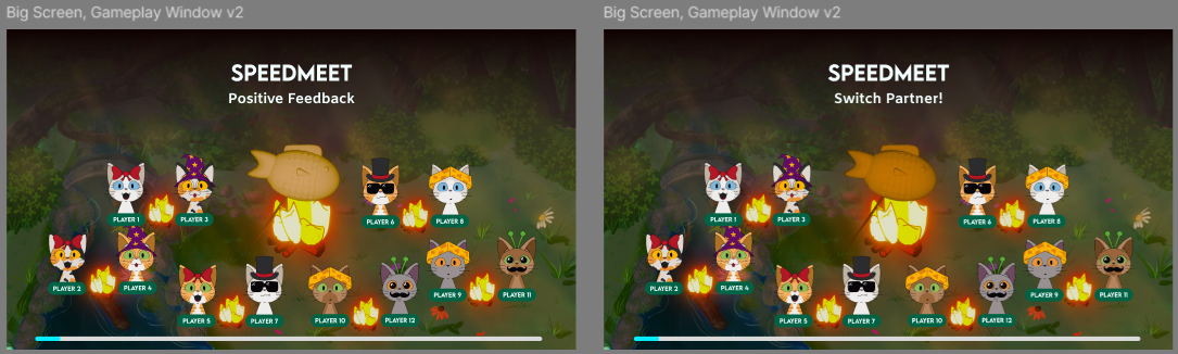
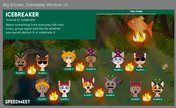
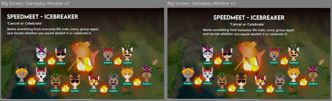
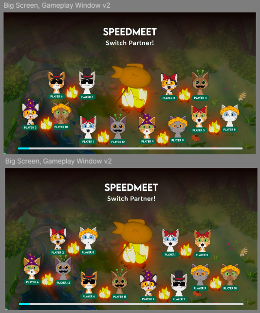
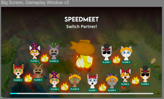
I also made all the screens with the cats changing seats for the map to wrap it up:
Afterwards I showed Wouter the prototype again and he said that this version looks very good.
The prototype designs were also validated after testing at school and during the night of the nerds
event.
Link to Usertest prototype at
school
Link to results questionnaire from the
event
STARR Reflection
Situation
The Speedmeet prototype required a big-screen experience that guided the group, supported the pacing of
the game, and visually communicated phases clearly.
Task
My task was to design the big-screen prototype and improve it through multiple iterations based on
feedback, design principles, and validation tests.
Action
I designed the screens in Figma based on the wireframes and created many visual variations for layout,
hierarchy, and spacing (DOT: Lab – Prototyping and iteration).
I experimented with Figma’s glass effect because it is a current UI trend, and evaluated if it improved
the visual clarity or added unnecessary complexity (DOT: Library – Trend exploration).
I applied feedback from Erem, Chris, and Wouter to reduce visual clutter, improve composition, and
strengthen hierarchy, using Gestalt principles as guidance (DOT: Workshop – Feedback session).
I also adapted the design for the event context by removing the QR element when it was no longer needed
due to the Wizard of Oz approach (DOT: Field – Stakeholder input).
Finally, the prototype was validated through user tests at school and during the Night of the Nerds
event, supported by questionnaire results (DOT: Field – Usability testing / Survey).
Result
The final big-screen design was cleaner, more readable, and better aligned with the intended gameplay
flow.
Testing confirmed that the concept and layout functioned in a real setting, strengthening the quality of
the iterative design process.
Reflection
This proof taught me that iteration is most effective when feedback, principles, and testing all support
each other.
Next time, I want to set clearer iteration goals per round (e.g., “reduce clutter,” “improve hierarchy,”
“increase contrast”) so each version has a measurable purpose and the progress is even easier to
communicate.